DESIGN #13: ICH BIN EIN...
I took German for a total of 6 years (3 in high school and 3 in college) and learned about JFK's Ich bin ein Berliner speech my very first semester. It was probably the most important speech of Kennedy's presidency. He was underlining the support of the United States for West Germany almost 2 years after the Soviet-supported Communist state of East Germany erected the Berlin Wall. Critics claim that " Ich bin ein Berliner" is literally translated as "I am a jelly donut." Apparently he should have said "Ich bin Berliner," and with a firm, elementary grasp of the German language, it made sense to me. Plus, I always found it amusing that his wordsmiths could have made such a huge mistake.
Tonight my goal was to create an editorial design based upon JFK's gaffe. Much to my dismay, after doing less than 5 minutes of research, I discovered the entire jelly donut story to be a complete fallacy. Without diving into an explanation of the German language, a Berliner really is a jelly donut, however "Ich bin ein Berliner" could also be translated as "I am one with the people of Berlin."
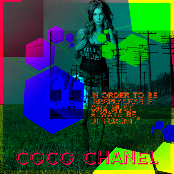
DESIGN #12: TO BE IRREPLACEABLE
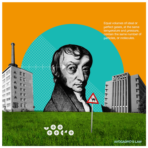
DESIGN #11: AVOGADRO'S LAW AND MARK WEAVER
There is a group of photos that I love on Flickr designed by Mark Weaver for GOOD Magazine. They actually have the same feel as a series of digital collages I created a couple of years ago. While each of Mark's pieces has a specific look to it, I started wondering if I could create my own versions of one of these designs using specific elements (arrows, the grid, desaturated buildings, scientist, etc) plus the quote - Avogadro's Law. Avogadro is the scientist you see in the center. It was interesting to break down the designs, however it wasn't quite as fun as I assumed it would be. I guess Picasso was right, "Bad artists copy, good artists steal." It's obviously not quite as fun if you're copying.
As I side note, I've realized that I rarely incorporate photos or images into my designs. I've made it a sub-challenge to incorporate at least one photo into each quote this week.
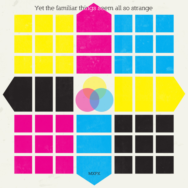
DESIGN #10: THE FAMILIAR SEEMS ALL SO STRANGE
To say it's been a crazy week (followed by a crazy weekend) would be an understatement. My weekend started this afternoon and will be probably be over within the next 4 hours. Yikes! I was specifically looking for a quote/lyrics that describe my mood today. There are times I have flashes of clarity and "Yet the familiar seems all so strange" becomes glaringly apparent. This design is more about the structure and rigidity of the layout and less about everything else.
DESIGN #9: MY OWN QUOTE
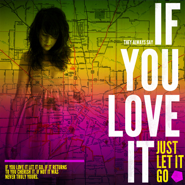
DESIGN #8: IF YOU LOVE IT...
After I left work this evening, I was contemplating not designing anything when I got home. The day was pretty hectic and I was really tired. However, once I was home, I realized that my Design a Day exercise has quickly become one of my favorite parts of the day. There isn't any pressure to come up with something the client likes - I can do whatever I want. Some days I'm really happy with my design, other days not-so-much...and that's okay. This design was inspired by some fashion photography I found on Ffffound.com of models interacting with typography. Anyone who knows me at all is aware of my slight typography obsession, so anything interacting with typography gets me excited. I'm not completely sure where (or more importantly why) I came up with today's quote, it just popped into my head.
Hope you enjoy!
