A few weeks ago I had the absolute honor of shooting a video for Adobe featuring Women in Technology. Enjoy!
Responsive Textiles Featured on Wearable Wednesday
I'm super excited to let you know that one of my projects was featured on Adafruit Wearable Wednesday.

Privacy Disrupted: Full Exposure
I have been thinking a lot about the notion of privacy lately.
It seems like the major population of the U.S. has a privacy paranoia of and fueled by large companies, government agencies, and of course, media.

A simple Google search for "privacy" results in the Google Privacy Policy, followed by news articles about the NSA, the FBI, and how they are tracking us. We are scared of companies and agencies using our information. We are terrified that they are watching us.
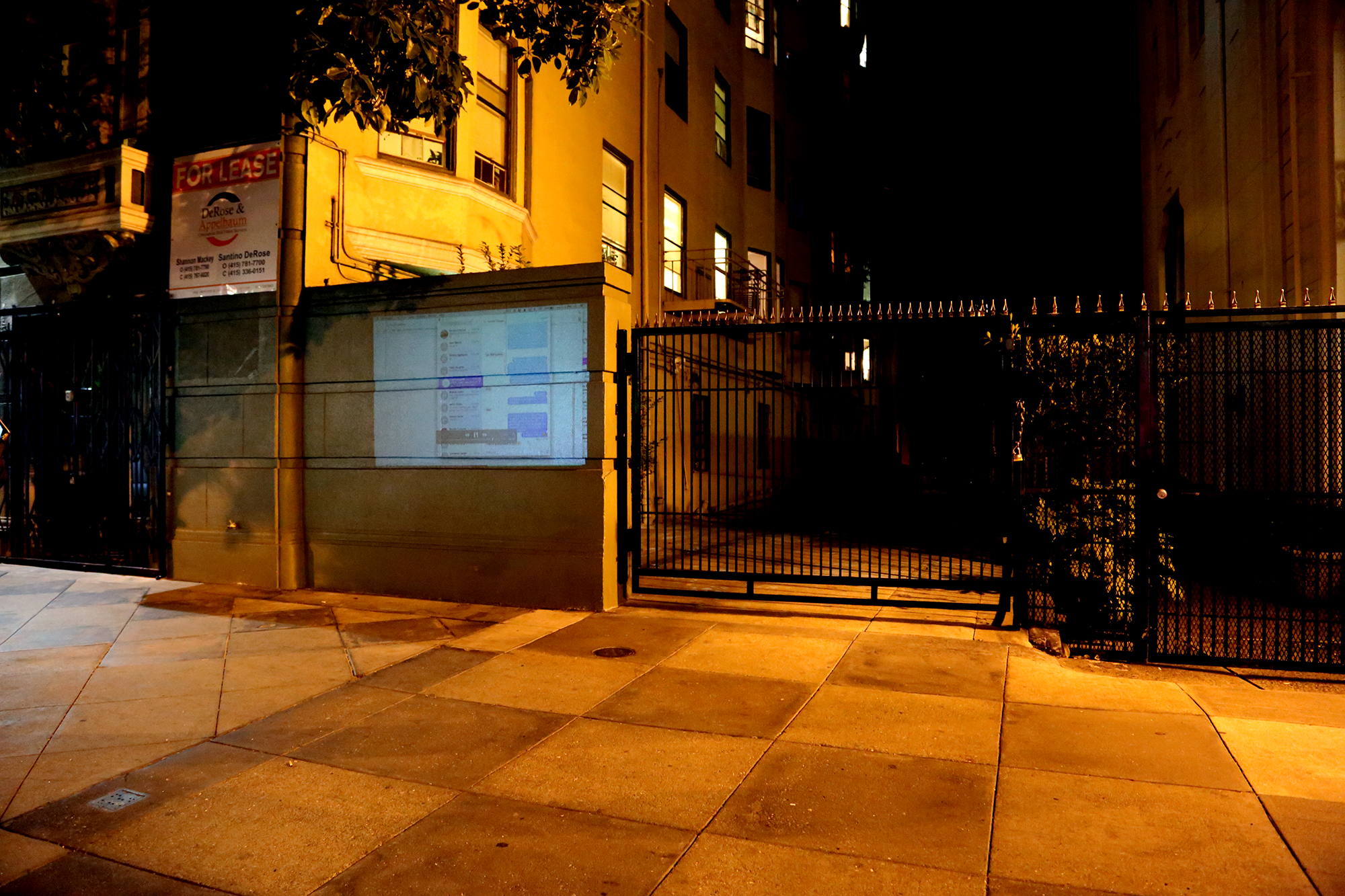
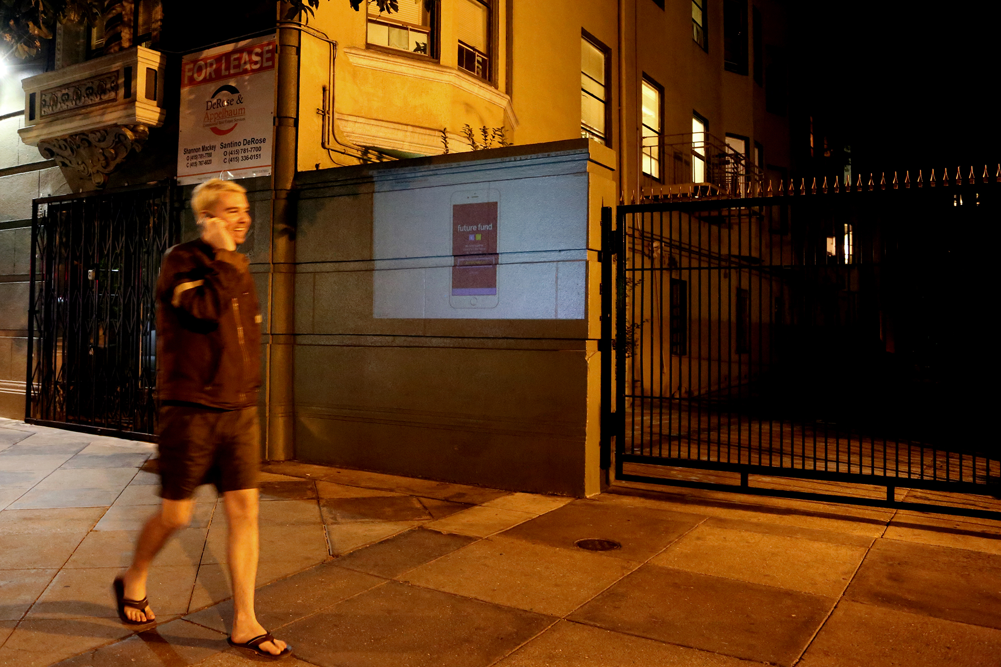
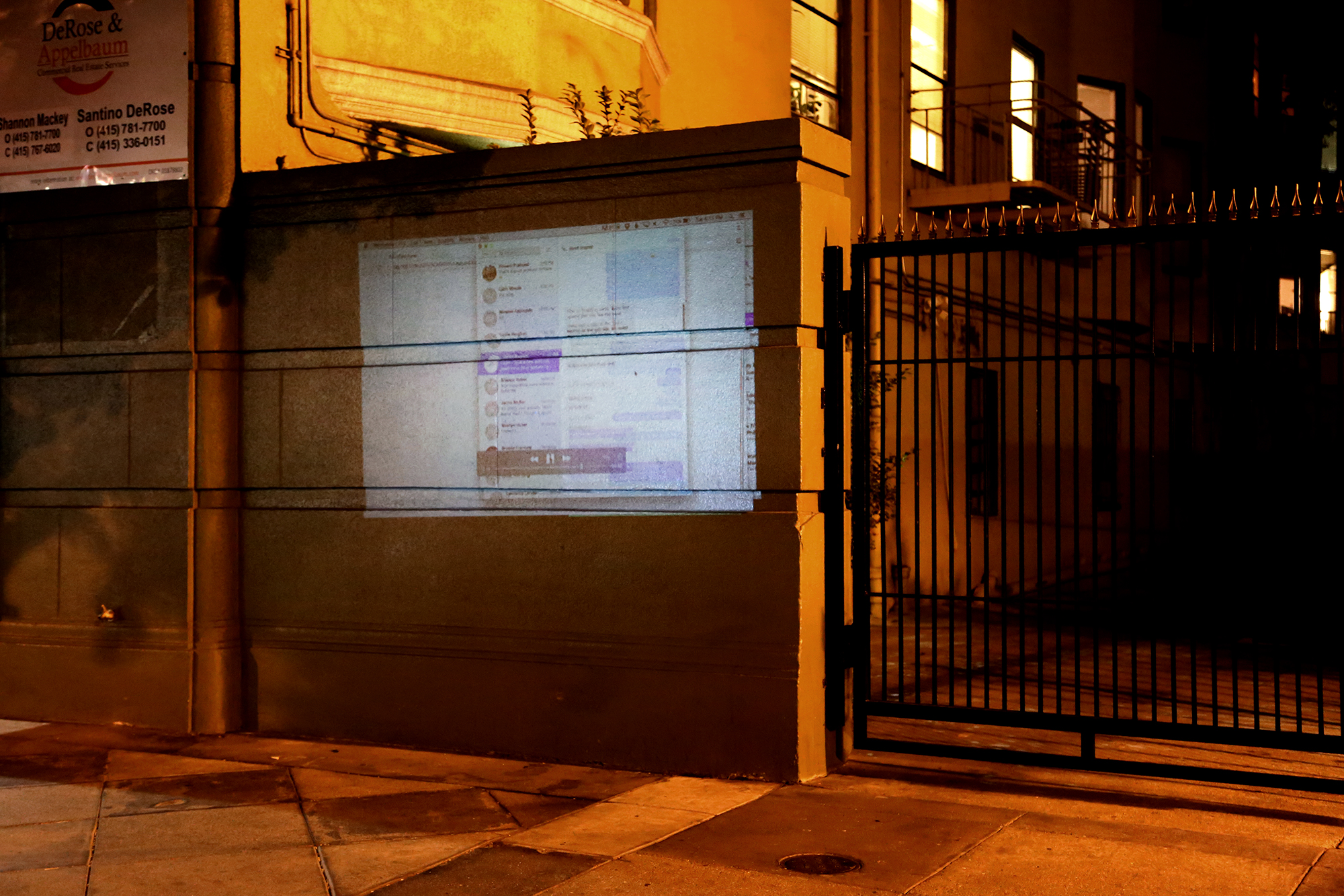
As a reaction to these fears, I decided to try and flip the notion of privacy on its head. For 20 minutes, I projected my live desktop onto the street in the Tenderloin outside of my apartment in San Francisco.
Everything. No holds barred.
And guess what? It mostly just made people uncomfortable (except for one guy who decided he wanted to dance through the projection). And those people weren't me.
A group of girls across the street watched without trying to be too obvious. I sent the above photo to one of my friends and he immediately replied that it made him nervous just looking it. It was a quick experiment on flipping the notion of privacy and the fears surrounding it, or lack thereof. It is obvious that there is much, much more to be explored in the matter.
I live in a city where startups are trying to disrupt everything from healthcare to your dinner. How about we disrupt some privacy?
#privacydisrupted
Framer: A super smart onboarding process...all through email
I recently download and began to play with Framer, a tool for prototyping micro-interactions. While learning something new is always a challenge, I've been particularly impressed with their onboarding process.
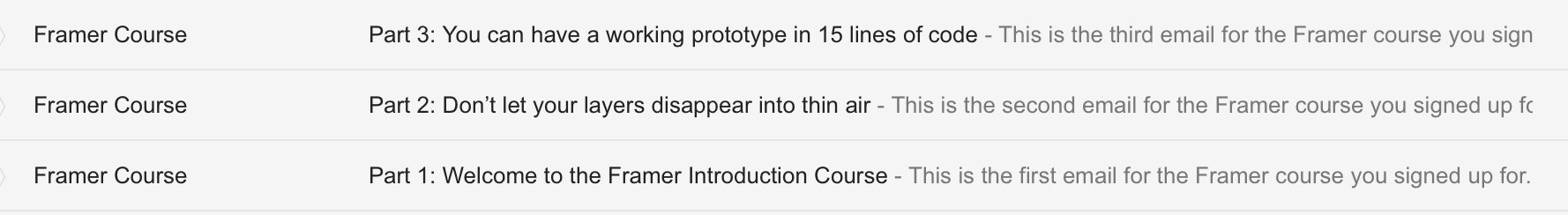
Every morning I receive an email detailing an integral step of getting to my first prototype. The steps are broken down into small chunks, so if I've been slacking, I could catch up to that day's email tutorial within an hour. Max.
So many products limit the entire onboarding experience to a 3 screen swipe inside the app or, at worst, almost nothing for the desktop experience. It has been incredibly refreshing to be enticed to open Framer and learn bits and pieces of a product in a chronological order that makes sense over the course of a few days, versus a 3 screen, 3 second app tutorial.
More to come...


De Program: Haags Broodje
From June 21 – July 11, I was a part of DeProgram, a design residency that focused on immersing artists and designers into the culture of Dutch design in an intensive study session. This the first project from the workshop.
Please be patient while the gif loads

ABOUT THE PROJECT:
Since being in Den Haag, I have eaten a lot of sandwiches. And they are delicious. I've also had a lot of interactions with the people in Den Haag and wanted to give homage to those interactions.
My goal for this project was to create something that represented my time and interchanges with the citizens of this city. The people of Holland seem to love a good sandwich just as much as anyone, so on June 29, 2015 from 12:30 to 13:30, I asked people on the streets of Den Haag to write down their favorite sandwich ingredients. With this list in hand, I purchased and created a sandwich for Den Haag in honor of loving two pieces of bread (i.e. two or more people) with something awesome in between (i.e. some sort of connection). This sandwich and book is a documentation of my interactions with the residents and visitors in Den Haag.

Generative Type
Exploring generative design as a way to produce new and unexpected temporal letterforms.
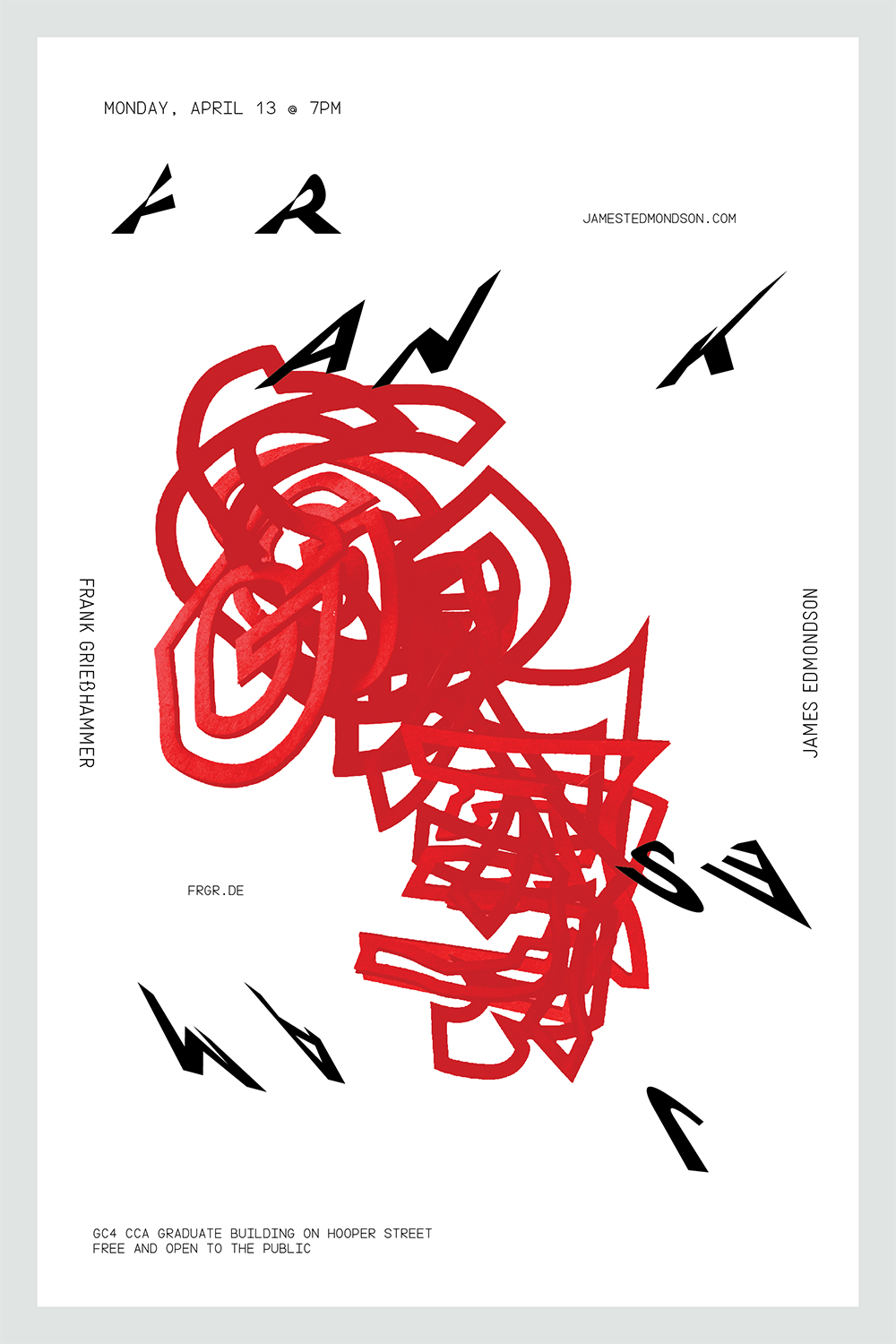
Type Talks: Frank Grießhammer + James Edmondson
A poster designed for a Font & Scripting Talk—a presentation by CCA alumnus James Edmondson, Type designer and Frank Grießhammer, Type designer and member of the Adobe Type Team