It's Valentines Day and lots of starry-eyed couples will be heading out for dinner. A perfect day for a food-related design! I had an entire story about being from the midwest, signs promoting beef and pork...but I have to admit, this one is just a good excuse to use pigs in a design.
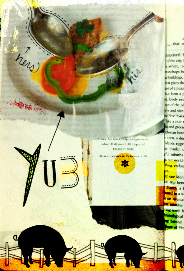
Things You Find on Restaurant Napkins
Last year I challenged myself to a personal design project. My goal was to create at least 5 non work-related designs each week, and each month I gave myself a mini challenge. It was a lot of fun, stretched me as a designer, and kept me away from silly time-wasting TV shows I didn't need to watch. So, I'm going to do it again.
My first challenge is to finish the Sketchbook Project that I didn't complete. It's never to late to start...er finish...right? The theme of my sketchbook was "Things You find on Restaurant Napkins", so I'm going to continue with restaurant / food-related designs for the next few weeks.
I'm also throwing in another challenge for myself. My train commute is about 75 minutes long and my goal is to have something ready to post in that 75 minutes. Whew! Enough challenges?
Here's No. 1: Feeding the Fast Food Crave
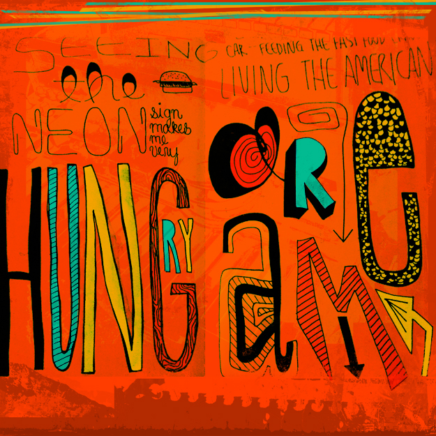 Seeing the neon sign makes me very hungry. Sitting in my car, feeding the fast food crave. Living the American Dream.
The Internet is Amazing
I feel like I'm rediscovering the internet. It's been filled with wonderful things today, and it's not even noon! Here's the run down:
Rebrand of Yogurtland
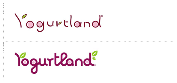 Image credit: Brand New / Under Consideration
My most recent food obsession is frozen yogurt. I can't get enough and am ashamed to admit that I think about it all day long. Earlier this week, my husband introduced me to Yogurtland, a smorgasbord of fro-yo and toppings. I'm partial to original with fruit toppings, but it doesn't matter because you purchase this stuff by the ounce. The ounce!
That being said, it was fun to see Yogurtland's rebrand featured on one of my favorite blogs, Brand New, this morning.
Turner Duckworth Studio Tour:
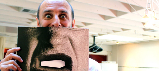 Image credit: The DieLine
Another one of my favorite blogs, The Dieline, featured a studio tour / interview with David Turner. Seriously lovely.
Erik Spiekermann
And last but certainly not least, you can listen to the König of Type talk about visual language, the design process, and of course, typography.
Erik Spiekermann - Putting Back the Face into Typography from Gestalten on Vimeo.
Typomundus 20
 Oddly enough, I started writing this love-post about my favorite book in November and never finished it. But, with all of my design books sitting on a bookshelf in California, I guess absence really does make the heart grow fonder.

I'm really picky when it comes to purchasing design books. I'll think about buying a book for 6 months before actually biting the bullet. That being said, my Typomundus 20 book was not that type of a purchase (I thought about buying for a whole 30 seconds), and for that I'm glad.

The purpose of Typomundus 20 was to preserve and document the most significant typography of the 20th century (which it does) and nearly puts every other design book to shame in the process. If you have to know, it was a significant source of inspiration behind my BFA thesis.

I count myself extremely lucky to have a copy with no rips, tears, and all pages in tact. And the best part? Nearly 4 years ago I snagged my copy for a mere $30. Look online now and you'll find copies going for anywhere from $75 to $100.
Hans Neuburg, Anton Stankowski, Lou Dorfsman, Piet Zwart, Hiromu Hara, and Hermann Zapf, you've created a masterpiece, and for that, I'm forever grateful.
A huge thanks to Unit Editions for soothing my soul with these gorgeous Typomundus 20 images
Type is for Kids
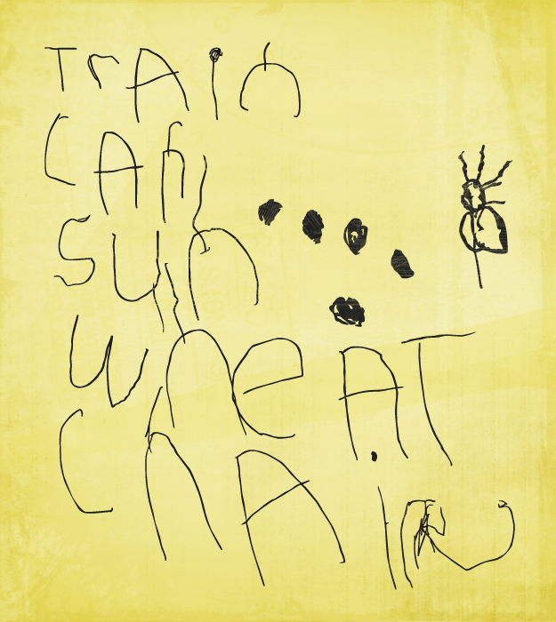
Remember the call for entries for my Social Typography Experiment? I'm getting close to the end of the vectorizing process and whew! What a process it's been. This afternoon I was working on one of the kiddie submissions (thanks to my sister for soliciting those) and was completely blown away by the arrangement of the letters on the page. I'm loving how each word flows into the next. And how cute is the little bug creature on the side?
Oh, and you're still more than welcome to send me submissions. Just go here for all of the information.
Goals for 2011
Lately, Erin over at Design for Mankind has been encouraging her followers to create a Life List. While I don't know that I'm ready to share mine yet, I do have a few items to tackle for 2011.
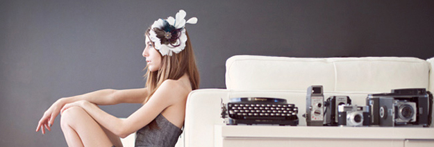 1. Find my style
While I've always been proud to have grown up in Kansas, and have lived in small midwest towns for all of my 27 years, I admit, it doesn't do much for your selection of clothing. I tend to flip flop back and forth between Forever 21, LOFT, and Banana Republic. With an abundance of styles and fashion choices just a month away, I've decided this is the year. I'm gonna find it.
Photo from Rachel Larraine Headpieces
2. Learn letterpress I once read that if you write your goals down you are more likely to accomplish them, and I've always wanted to learn letterpress. So there. Done. Plus, I secretly hope to find a job in San Francisco at a design / letterpress shop. Photo from HotBedPress.org
3. Apply to grad school (recycled) This one is recycled from last year's to do list and I've already got a good start. I had all of my schools picked out and was in the process of applying when we learned that we would be moving, so it was pushed to the back burner. Well back burner no more! Grad school, here I come. Photo from RISD.edu
Three seems like a good number of goals (I have a thing for odd numbers) but I have a fourth goal which is really more of a challenge.
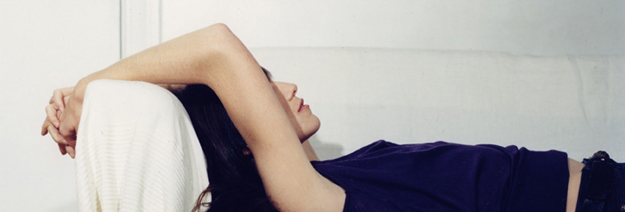 4. Learn something new about myself
I'm not typically the type of person who thinks about who I am or what I want to be. In fact, I'm the type of personal who tends to do things on a whim (which can be really, really good, or really, really bad). So this year, while it may seem like an odd goal to some of you, I challenge myself to take some time to learn just one new thing about who I am. Can I do it? We'll see in 2012.
Photo from Tina Tyrell
Brooklyn Bride Holiday Handmade Card Swap
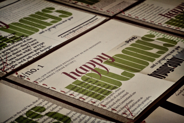
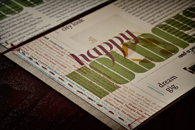
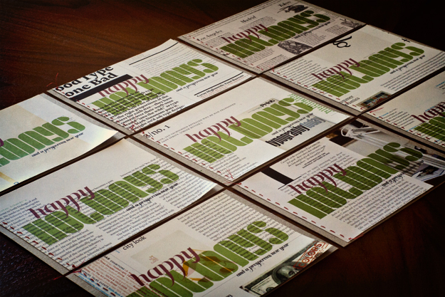
For the second year in a row, I decided to participate in the Brooklyn Bride Holiday Handmade Card Swap. Last year, I repurposed our personal Christmas cards and created a custom cut, typographic card. This year, however, I wanted to use materials that I had on hand. I printed my design on old magazine spreads, cut them into 5 x 7 pieces, and sewed them onto chipboard using red thread. My favorite part about these cards is that each and every one of them is completely different. Is it conceited to say that I'm completely obsessed with the result?
I've got a couple of extras on hand if you want one for yourself - just shoot me an email with your name and address. At the same time, I have to admit, it may be January before I can send them (we're in the middle of moving across the country).
