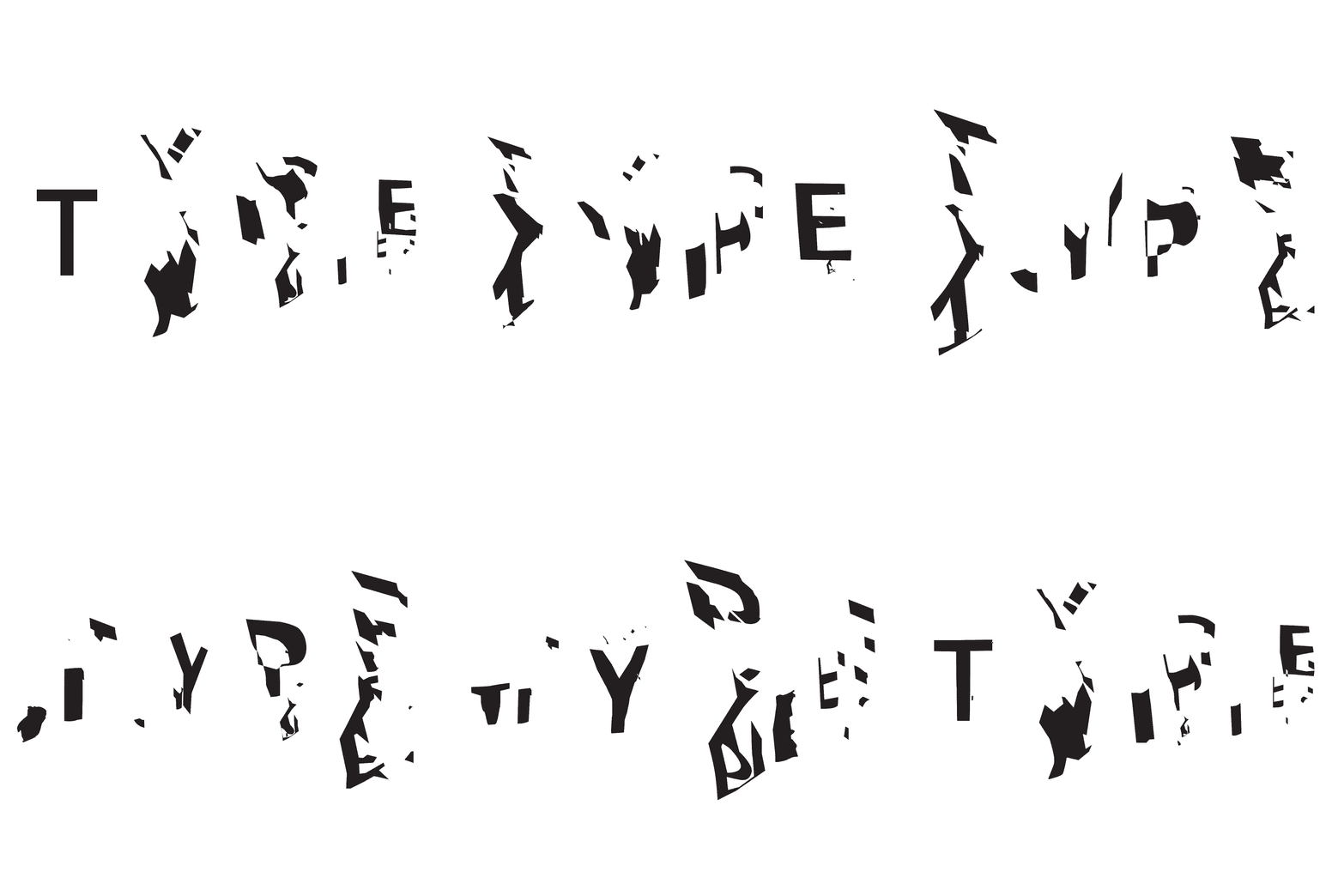
Examining the transitory, fluid nature of temporal type
Does legibility matter?
When dealing with fluidity in temporal typography, legibility is continually in flux. This means that legibility is a process that occurs (in various measure) as long as the form is mutating. Legibility assumes the viewer of the type is attempting to read, however, temporal type is less focused on readership and more focused on viewership.
Factors of viewership include perception and perspective. Perception is a constant fluctuation of past, present, and future form, requiring a continual rationalization about what is being seen. The perspective or viewpoint determines the angle at which the form is being seen. Due to the transitory nature of temporal typography, the perception and perspective of these forms may also be fluid.
So. The question of the week is whether legibility and readability are contributing factors or simply limitations of temporal typography?
A to B in 104+
Starting to finally play with color (i.e. shades of grey). Exploring transitions between A and B.
I don't care if you can't read this
Within the field of typography, letterforms usually embody static or kinetic form. However, there is yet another category that escapes the purely static or purely kinetic. This is temporal typography.
Unlike kinetic type, it is not the movement or motion of the type that is meaningful in temporal typography, but the transformation from one state to the next. During the transformation process, a variety of forms are created — they may not be able to be identified as type, but are strangely familiar abstract forms. In her paper Fluid Typography: Construction, Metamorphosis, and Revelation, Dr. Barbara Brownie, director of postgraduate study at the University of Hertfordshire, calls these forms "asemic" an open wordless form of writing with no specific semantic content. In asemic writing, a vacuum of meaning is created that is left for the reader (or in this case viewer) to fill and interpret.
As the familiarity of a form or object decreases, the interpretation requires an active exchange between recognition and perception, encouraging additional levels of interaction from the viewer and allowing new possibilities to be imagined. Understanding and testing the limits of where this interchange occurs will allow me to speculate on and reimagine letterforms that communicate in new or different ways.
My intention is to examine the qualities of temporal typography and develop a variety of processes, both physical and digital, to explore the boundary at which text meets image. By challenging pre-existing assumptions of letterforms, I am studying how letterforms can become temporarily typographic and transform over time to adopt alternate identities.
Temporal Type: All the right moves
Experimenting with the boundary between image and type. Exploring the interchange between recognition and perception.
You Spin Me Round
"A" has never been so happy.
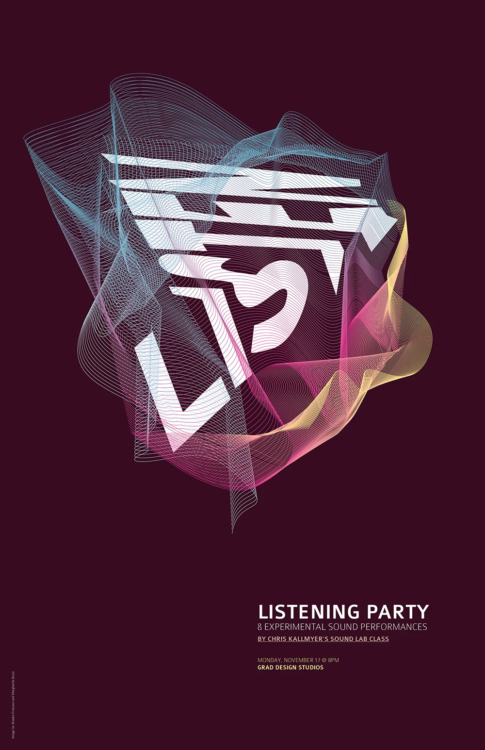
Listening Party + Experimental Sound Performance Poster
I'm taking an Experimental Sound Lab class taught by Chris Kallmyer during my grad studies at CCA this semester. It's been incredible. On Monday, we're hosting a Listening Party & Experimental Sound Performance event, so naturally, a poster needed to be designed.
I've been struggling lately with how my thesis studies can fit back into the world of design, but it seems they may have found a place. Along with my cohort, Margherita Buzzi, I designed a series of posters for the Listening Party event. Thrilling.


