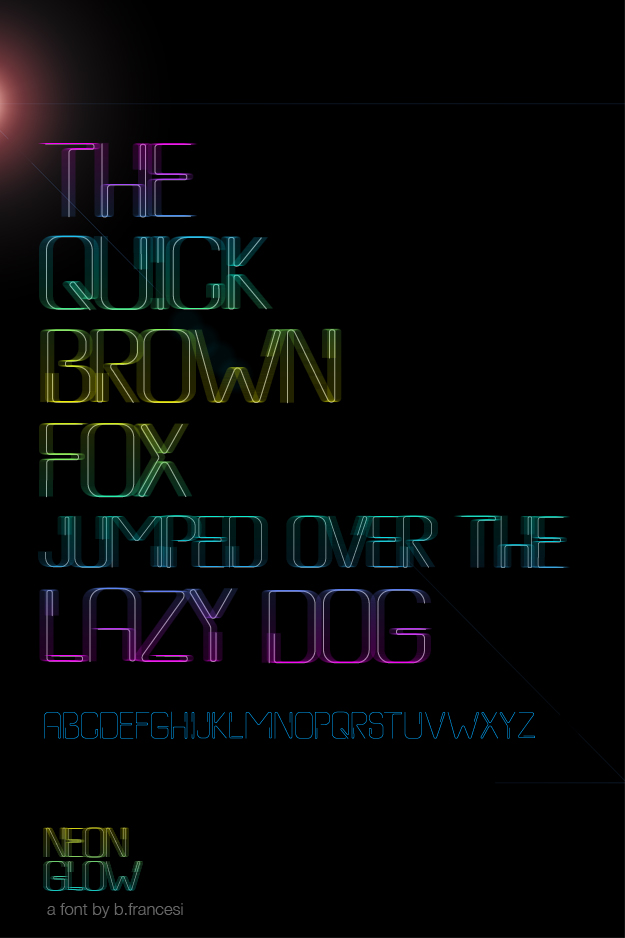
After a few photoshop modifications, I've finally created a poster for one of the versions of the font I created this summer. If you compare, you can tell that I've applied motion blur and a gradient overlay to the font stroke. While it's interesting at the very least, it still looks slightly commercial. Not sure that I'm stuck on this yet...
