I found this post on the blog at Crestock.com. Enjoy! ...although, I wonder if they could make the font bigger and put a thicker border around the most important works.
----------------------
If you’re a designer, you’ve probably had to deal with lots of annoying client feedback throughout your career. Let’s face it, a lot of clients have no idea what good work looks like. In fact, I reckon that if the average client was presented with classics of Western art, they’d probably still try to offer up some constructive criticism. And it might look something like this...
10 - Mona Lisa
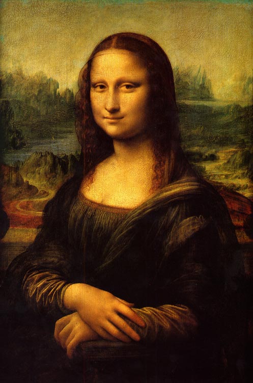 Client feedback:
We think it would help communicate our superior customer service if we make her a call-center employee, so please give her one of those headsets. Further to that, since she's just helped a customer solve their problem, why isn't she smiling?
9 - The Physical Impossibility of Death in the Mind
of Someone Living
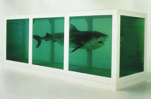 Client feedback:
We love this! So profound, and it really makes you think. But just a couple thoughts: Instead of a shark, can we make it a couple of rabbits? And instead of being dead, let's make them alive. And throw some grass in there so they can frolic.
8 - The Scream
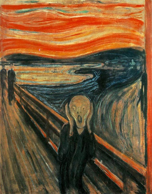 Client feedback:
From his expression, it's not totally clear he's screaming. We showed it to one of our HR girls and she said "It looks like he's really tired and having a yawn." So let's add a voice bubble with text that reads "Nooooooo!" (for the text, use Comic Sans).
7 - Venus de Milo
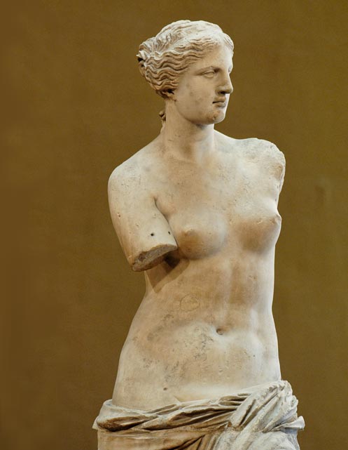 Client feedback:
Is this even finished? And we'll have to check with legal and get back to you about her being unclothed.
6 - The Last Supper
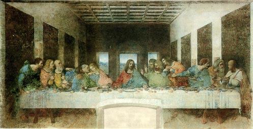 Client feedback:
Our customers are both men and women, from a wide variety of cultural and socio-economic backgrounds, and we feel this doesn't quite reflect that. As such, please adjust your choice of models to include one MILF-type with a baby stroller (young, urban mothers are one of our biggest demographics), a man in coveralls with a hardhat, an Asian (doesn't matter what type), and a Native American. Oh, and make that long haired metal dude in the middle black.
5 - The Kiss
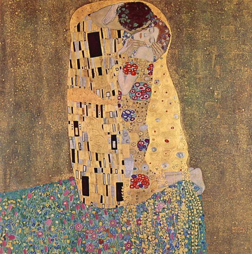 Client feedback:
We have two words for this: Not hot. Let's see some skin. Try another revision, with her in a red lace bra and thong.
4 - Ceiling of the Sistine Chapel
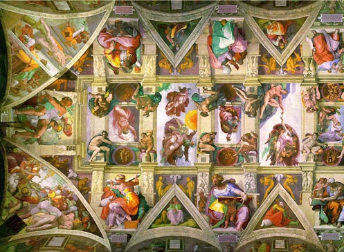 Client feedback:
We appreciate your hard work and dedication as you worked on this these last four years. Unfortunately we only budgeted 20 hours of design for this project. So we'll have to ask that 35,043 hours of your work be pro bono.
3 - Guernica
 Client feedback:
We like the direction you're going with this sketch, but we thought you were presenting finished mock-ups today.
2 - The Thinker
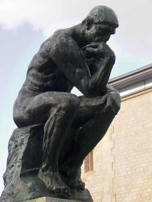 Client feedback:
We want to improve conversions by making things more interactive. So please add a poll question to this, with the following text:
What's he thinking about?
a) Who's going to win "So You Think You Can Dance"
b) Where he left his pants
c) Whether there's any more toilet paper
d) That Venus chick is amazing - wonder what line I could use to pick her up?
1 - Andy Warhol's Campbell Soup 1, 1968
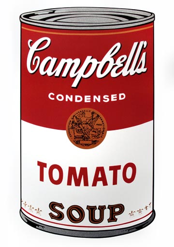 Client feedback:
Make the logo bigger.
 Client feedback:
We think it would help communicate our superior customer service if we make her a call-center employee, so please give her one of those headsets. Further to that, since she's just helped a customer solve their problem, why isn't she smiling?
 Client feedback:
We love this! So profound, and it really makes you think. But just a couple thoughts: Instead of a shark, can we make it a couple of rabbits? And instead of being dead, let's make them alive. And throw some grass in there so they can frolic.
 Client feedback:
From his expression, it's not totally clear he's screaming. We showed it to one of our HR girls and she said "It looks like he's really tired and having a yawn." So let's add a voice bubble with text that reads "Nooooooo!" (for the text, use Comic Sans).
 Client feedback:
Is this even finished? And we'll have to check with legal and get back to you about her being unclothed.
 Client feedback:
Our customers are both men and women, from a wide variety of cultural and socio-economic backgrounds, and we feel this doesn't quite reflect that. As such, please adjust your choice of models to include one MILF-type with a baby stroller (young, urban mothers are one of our biggest demographics), a man in coveralls with a hardhat, an Asian (doesn't matter what type), and a Native American. Oh, and make that long haired metal dude in the middle black.
 Client feedback:
We have two words for this: Not hot. Let's see some skin. Try another revision, with her in a red lace bra and thong.
 Client feedback:
We appreciate your hard work and dedication as you worked on this these last four years. Unfortunately we only budgeted 20 hours of design for this project. So we'll have to ask that 35,043 hours of your work be pro bono.
 Client feedback:
We like the direction you're going with this sketch, but we thought you were presenting finished mock-ups today.
 Client feedback:
We want to improve conversions by making things more interactive. So please add a poll question to this, with the following text:
 Client feedback:
Make the logo bigger.