Our culture is obsessed with being original, yet I can find a million people that follow a trend. Hipsters crave differentiation but they're all the same. Designers that use nothing but Helvetica crave simplicity, but more often than not, their simplicity ends up looking the same. I'm not saying this because I'm any different, it's just an observation.
Design #70: Circles - The Originals
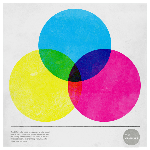
The month of May is dedicated to circles. These perfect creatures have always played a role in my designs. In fact, my very first digital design incorporates circles. They're beautiful, they're perfect, and they're absolutely lovely. I've started off with the very basics. Circles and CMYK. Fantastic.
WHY DIDN'T I THINK OF THIS?
Absolutely amazing work on Behance by Allison Wilton for her BFA thesis. Of her work she says, "Shown above is documentation of the book I designed, printed and bound containing documentation of all my senior thesis work. The book contains images I shot of all 16 artists books I completed in one semester along with writing about each project. I also included pages that were taken from actual monoprints that I used to make the artist books. 17"5".75" hardcover bound with aluminum handle."


helvetica marker
 Combined, these people are the Einstein of our time. They brought us the Helvetica movie and now a marker that writes Helvetica. Genius.
