 This just in via Thought for the Week by JohnsonBanks. Something any designer can appreciate.
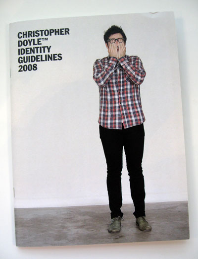
"Sydney-based designer Chris Doyle has obviously done too many large identity projects recently - he decided to create a set of guidelines for himself as he began wondering ‘how my personal identity would be documented if it were considered in graphic design terms.
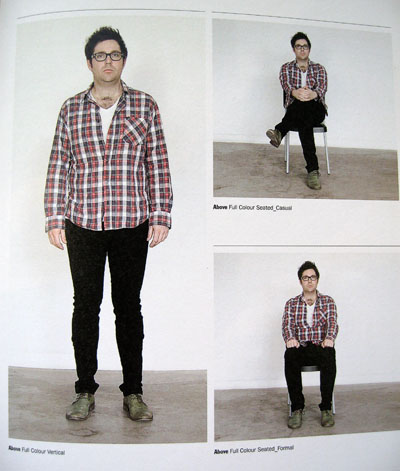
So the image above is from a spread marked Full Colour Vertical_Private. The following 'key identity formats’ are, of course, Full Color_Vertical, Full Colour Seated_Casual and Full Colour Seated _Formal.
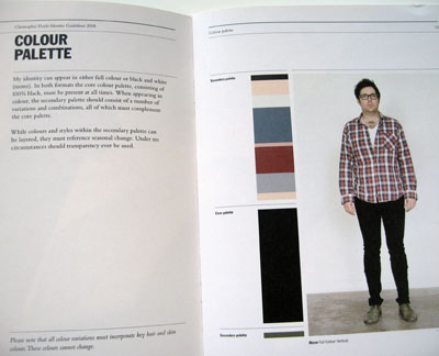
There’s a funny section about colour palette, then colour variations.
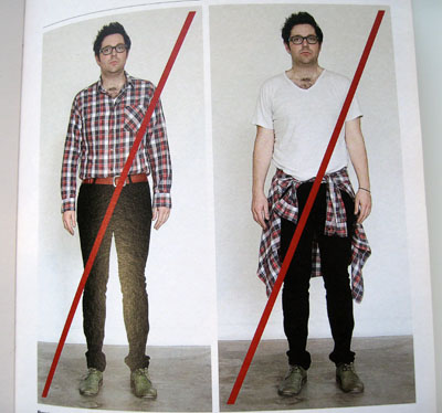
And ‘incorrect use’.


