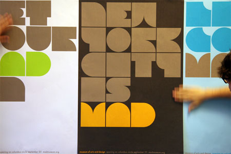
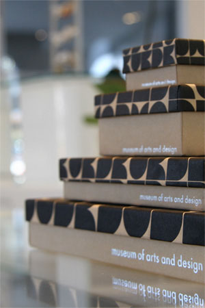
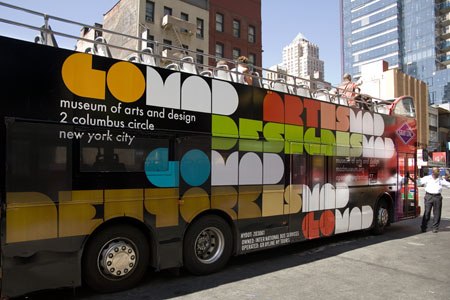
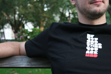
The Museum of Arts and Design (or MAD) in New York opened its doors this weekend with a lovely kick-off thanks to Pentagram. They created a lovely typeface Pentagram named MAD face (...what else?) by combining squares and circles - and as you can imagine is very fun, but hardly legible. Here are a few shots of this ingenious work of branding. Delicious.
white space
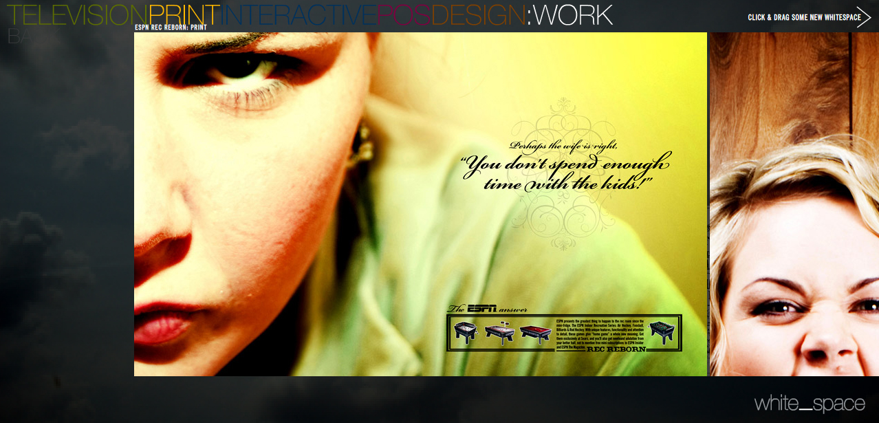
More gorgeous work from White Space.
the most beautiful bottle in the world
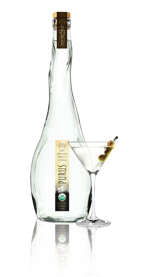 PURUS is 100% organic vodka made from Italian wheat and water from the Alps. Designed by Jean Scholtes, Creative Director of white_space.
typography
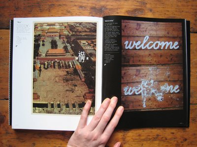 On Monday I ran across this book on Amazon aptly titled Type Addicted. In the past six to eight months, I've had a renewed vigor for type (I was hopelessly addicted after my first typography class at Kansas State University in 2003). And now, once again I can't get enough of it. My new book arrives today compliments of free 2 day shipping via my trial version of Amazon Prime.
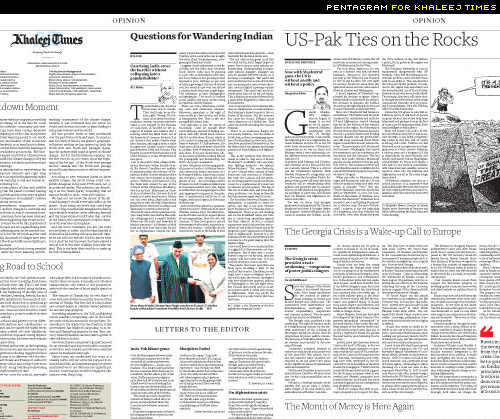
One of the blogs I check on a daily basis has had somewhat of an ongoing discussion about newspaper design. Pentagram recently redesigned the layout for the Khaleej Times and the author commented that he doesn't get very excited about newspaper design. For the most part, I have to agree on that point. Newspapers in the United States can be especially hideous. The Virginian Pilot however, proves that sentence wrong (although I can't say the same for their website).
iSetta
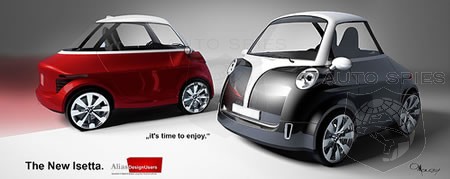 I could hardly contain myself when I found this delicious photo rendering posted on pica + pixel this evening. It's even better than the Smart car (which I makes me drool every time I see one).
Here's what they had to say:
"BMW just announced the new iSetta, a two-seater electric city car. Its designed was inspired by the original Isetta from the 50s. This new model ss still in the concept phases and has not passed all its crash testing so the design will probably change but there has clearly been efforts to maintain the look-and-feel made famous with the original. Plans are to have it available for sale to the public by 2010."
Forget reserving a Smart car. iSetta, here I come!
buttons.
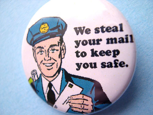
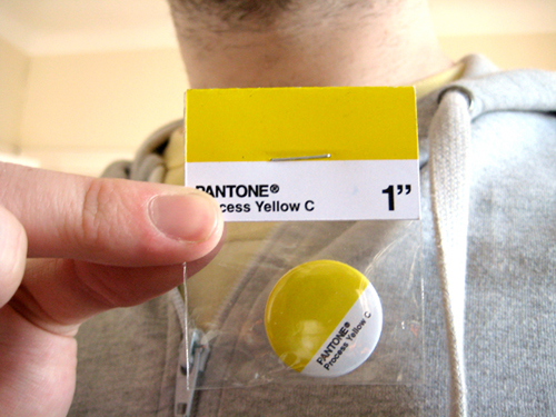
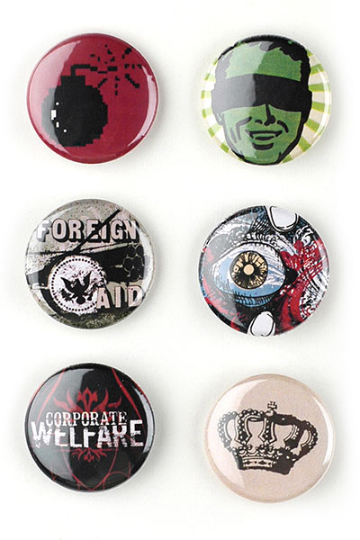
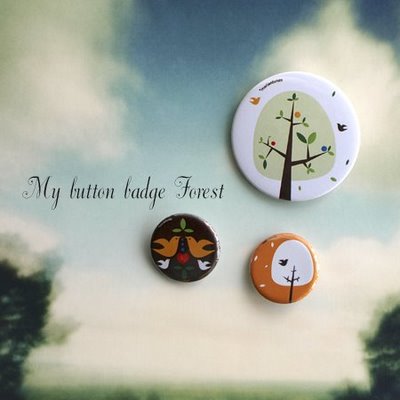
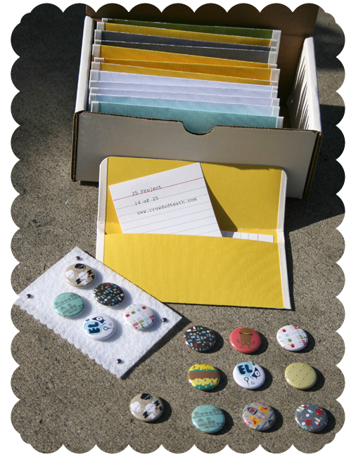
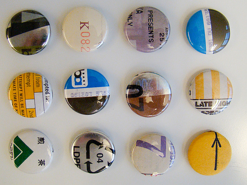
PSDTUTS is a site I regularly visit for ideas, inspiration, and Photoshop tutorials. Today (somewhat out of the blue) they had a great post featuring 40+ Creative, Courageous, and Campy buttons. The author, Sean Hodge, says this: "Buttons can be visually interesting, as the collection below illustrates. They can be clever and conceptual. Many of the examples below pull textures from various sources. One of the more conceptual examples ties together cassette tape designs and button textures. And in the case of the "void" button you have the message and stark emptiness of minimal design unified. There are numerous ways to get creative with your button designs, below are just a few."
I'm slightly jealous of these, simply because I love buttons but have never had a chance to make any of my own. I think one day when I'm teaching at a university in some cool city, I'll hold a summer class called Button Making.
Here are a few of my favorites:
Okay, so I had a lot of favorites.
scott hansen (aka iso50)
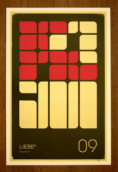
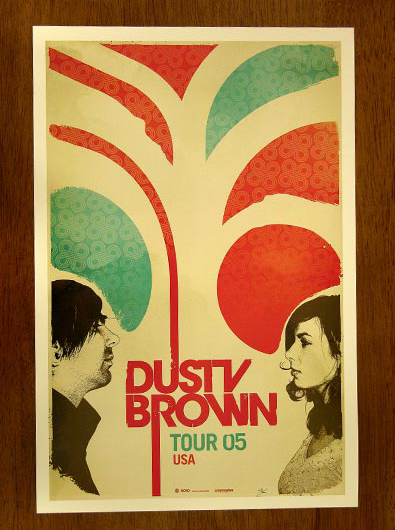
I couldn't help but post some of my favorite posters designed by Scott Hansen. Is it possible to crave someone's style? ...because I do.
