DESIGN #45: Y
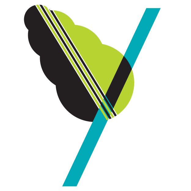
Most of my letters start with some idea of the direction I plan to go, and it usually ends up somewhere along the lines of my original idea. Today was an exception. Last night I knew exactly what I wanted Y to look like. Really curvy and beautiful. I even sketched it out which I tend not to do with my design a day letters because my goal is to spend no more than an hour on any design a day project. When I started converting the beautiful hand drawn curves into bezier deliciousness, I just couldn't make myself finish. It seemed too cliche.
What you see below is an experiment. Beautiful or not, experimentation is productive, and in this case, is the result of throwing a bunch of shapes into one space and forcing myself to organize them in a way that works.
DESIGN #44: X
DESIGN #43: W
This weekend I realized my goal of finishing the entire alphabet by the end of February was a little precipitous. Between Friday evening and Sunday I would have needed to design 4 letters and while that certainly would have been possible, I don't want to start focusing on quantity over quality. W was inspired by a gorgeous Blackletter font found on the I Love Typography blog this weekend. Absolutely drop-dead gorgeous. The digital version is available for purchase on MyFonts.com as Fette-Fraktur and will probably be my next font purchase.
