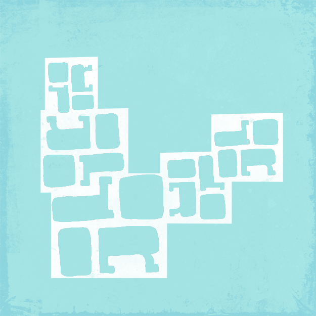
Word poem #1: An experiment in human typography
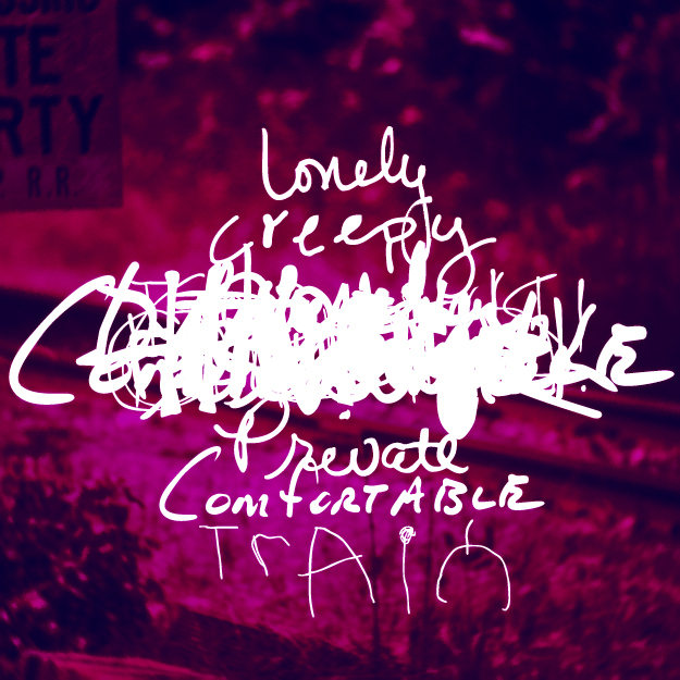
These word poems are part of my Human Typography Experiment. An effort to revitalize appreciation for the ordinary.
Word poem #1: An experiment in human typography

These word poems are part of my Human Typography Experiment. An effort to revitalize appreciation for the ordinary.
The most successful book is that which inspires you to put it aside and create.
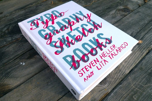
Thank you to my sweet, thoughtful husband who surprised me with Typography Sketchbooks, curated by Steven Heller and Lita Talarico.
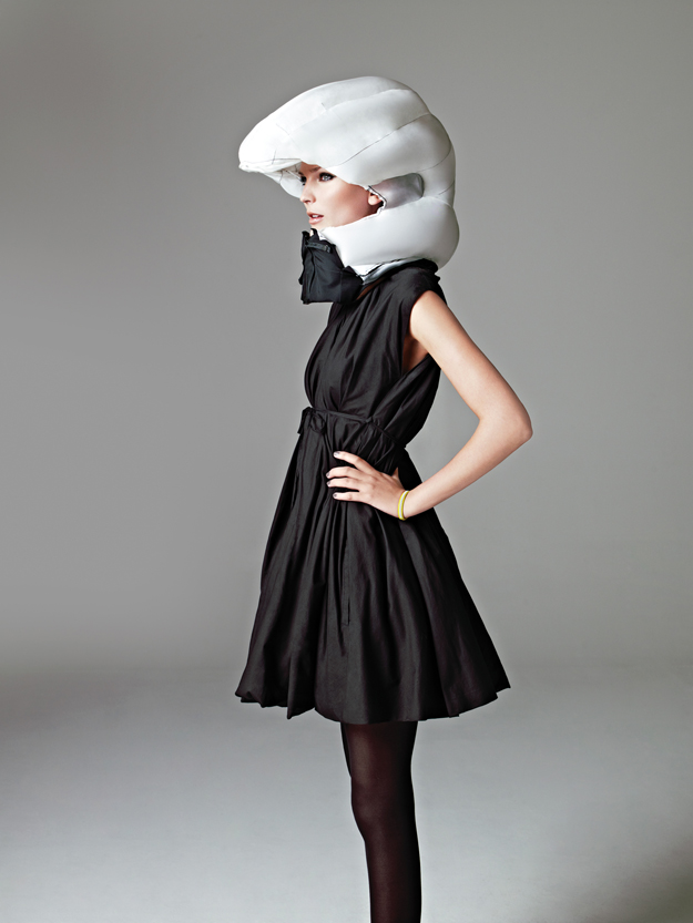
I have horrible luck with bikes. A few months ago, St Patrick's Day to be exact, I was in a bike accident that temporarily cost me my sense of taste and smell. And no doubt a few brain cells. Since then, I've vowed to stay away from them. A friend recently sent me a link to this bike helmet by the Swedish company Hövding, and it just may have me re-thinking my vow. It's a stunning feat of a marriage between technology and fashion.
And that dress! Eat your heart out.
This post has been sitting in my drafts folder waiting on images for over a month. Maybe its time to just publish and post more delicious food images later? Below are heirloom tomatoes from Farm Fresh to You located in the Ferry Building Marketplace.

Disclaimer: I don't consider myself a food snob or a foodie. I just like to know what I'm eating.
Growing up with a mother who made amazing food (specifically English toffee at Christmas-time) and a father as a food scientist, Velveeta cheese didn't have a chance in our home. In fact, not many processed foods did.
Because of this, I've always been conscious of the food I eat, but since moving to San Francisco, a place where everyone is a foodie in some sense, I've become particularly obsessed with eating food in it's most natural state. Moving from the midwest to California, it's been a pleasant surprise to realize how easy it is to buy seasonal vegetables at one of the many of farmers markets during almost any week of the year.
While it used to feel like chore to pick out a menu and food for the week (I'm a budget-y type person) it's become especially fun to head to the store or farmers market, select the most seasonal produce, and make a menu from there.
So what's the point? I've discovered an incredible sense of self-satisfaction just by knowing that my food didn't travel 2,000 miles to my mouth when it could have traveled less than 50.
It's been a while since I've posted anything new to my Twitter series, so over the weekend I decided it was time to get inspired. While lazily scrolling through Twitterland, a stream of tweets by @splorp caught my eye. They were simple one-word posts with a single image. Rather than just one design, I've created a short series that highlights the strange yet endearing tweet. You can thank me later that I refrained from writing peachy
I've been thinking about getting a few of my designs printed, and these tiny 7x7 inch designs just might be the first.
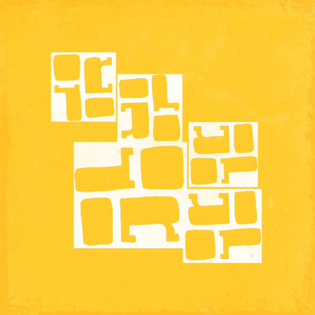
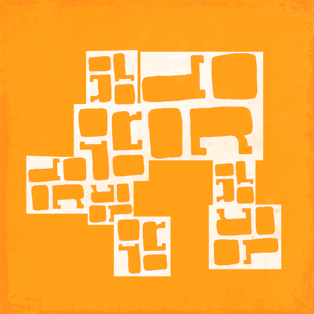 The Commute Design Project is my personal challenge to create designs on my train commute from work to home. The Twitter series is part of my goal to document spamm-y, interesting, and funny tweets through hand drawn type
It's been a little quiet around these parts lately — I haven't been super motivated to post anything. But hey, we all need a little break sometimes right? I'm completely in love with the dreamy quality in this week's Fancy. The lovely images and email content come to you from product designer Joey Roth, the clothing retailer Free People, the San Francisco online magazine 7x7, and the online font shop Hype for Type.
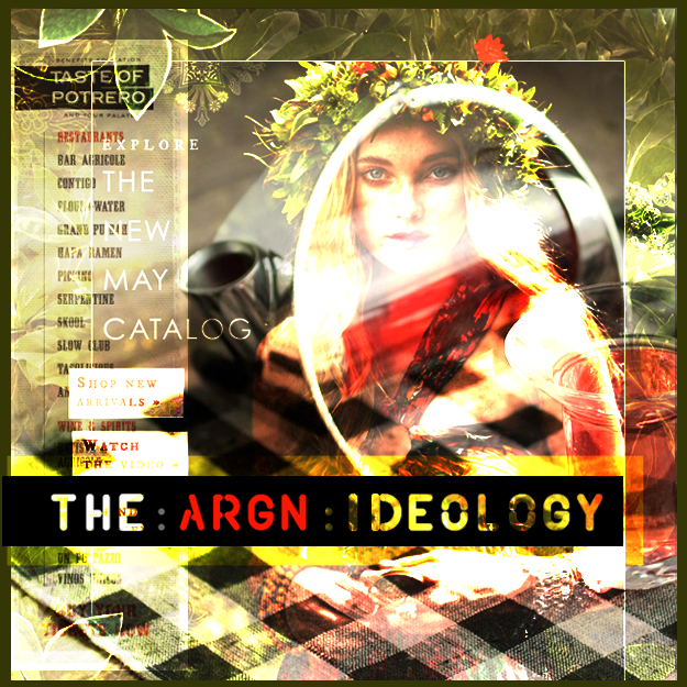
Strike My Fancy is a weekly sneak peak into my inbox that showcases a collage of the most beautiful email I received over the past week.
It's Monday and we all know what that means. More email. Big thanks to MyFonts.com, Threadless, and Design Observer for providing the content and inspiration.
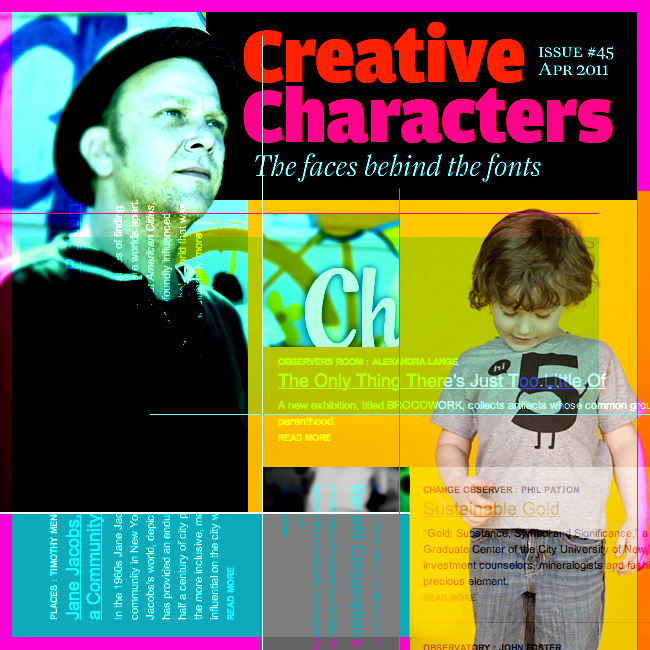 Strike My Fancy is a weekly sneak peak / collage into the most beautiful emails I received the week prior.