FINIKY
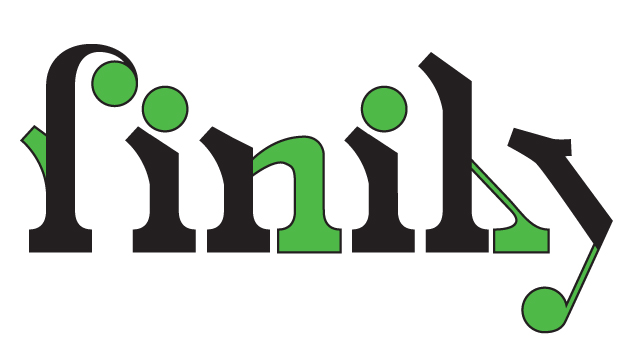
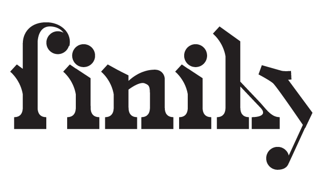
No, I've not been spelling it incorrectly. The font (or soon to be font) is called Finiky. In between freelance projects and Design a Day, this font will eventually make its debut. I have no doubt it will be as successful as Neon Glow, or Staples, or Paperclips, or whatever it will eventually be.
DESIGN #28: H
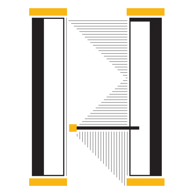
H has always held a special place in my heart. It's the first letter of my maiden name and it's a letter that you can't mess up, no matter how hard you try. It's sturdy, delicate, geometric, abstract, curvy, hard, soft, fun, serious.... it's just about anything you want it to be. And that's how I like it.
DESIGN #27: G
DESIGN #26: F IS FOR FINIKY
I took my very first typography class in 2003 as a freshman at Kansas State University and have been madly in love with typography ever since. One of the projects in that class was to use existing typography and modify it to create 2 new fonts. We were only required to create enough letters to spell out the name of the font. One of the fonts I created is Finiky and was based upon the cover of a Switchfoot album (see image here). I'm still in love with it and plan to create a full font (or even an entire typeface if I'm feeling super motivated) in the future.
Today's F is based on Finiky. So it's time to saddle up world! And say hello to F!
