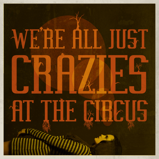
I took a short hiatus at the beginning of this week because of all the craziness at work. The upside is that things have been extremely busy. The downside is that I'm exhausted and out of motivation when I get home. Thankfully, things have calmed slightly and my motivation and inspiration are back! The quote and embellished typography are mine and they give you peak into my head. Yes, sometimes I think I really am crazy.
New Work: Travis and Erica
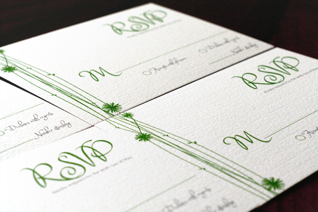
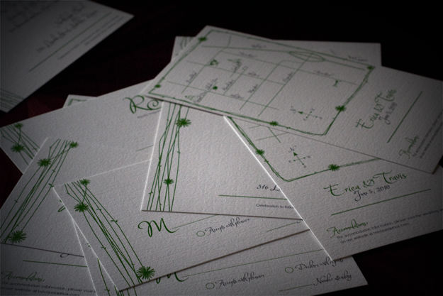
In January, one of my friends from high school asked me to design the Save the Date cards for her wedding (see them here). Once we finished those, I was thrilled when she asked if I would also design her wedding invitation suite. While her save the dates had a trendy chic feel, she wanted to go with a more typographical / modern calligraphy style for her invites. Her colors are charcoal and kelly green and the invites were printed on Neenah ESSE 105lb Pearlized White with texture. The finished invites are really nice and tactile and were printed by Courier Printing in Grabill.
April Roundup
In case you missed any of them, here's a roundup of April's ampersand love. 01. Introducing the & 02. Swiss and Toilets 03. A Little Springtime Love 04. Land of Ampersand 05. A Typenerd's Love Letter 06. Newsy Floozy Juxtaposition 07. Ampersand History 08. Haiku for a Rainy Day 09. In the Springtime 10. Living in a Chemical Nightmare 11. Purple Reign 12. & Cut.
Design #69: The Cut
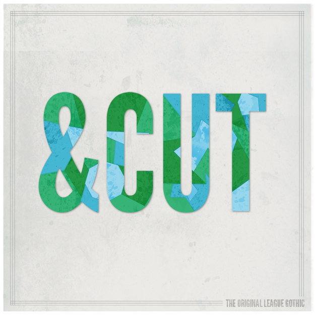
Today marks the last day of ampersand love. April has come to and end (well, more like it actually came to an end on Friday) so it's time to move along to May's challenge. "And cut." is something you tend to associate with film production but with this design the phrase symbolizes the end of a design challenge and also is reminiscent of the design style - kind of a cut paper overlay.
Design #68: Purple Reign
I really love this new, experimental font that I found. It's called VAL and you can download it from Fontfabric for free.

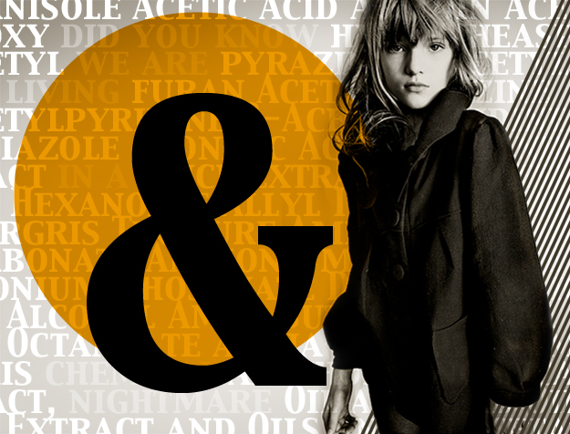
Design #67: Living in a Chemical Nightmare
Lately it's struck me how many chemicals we use in, on, and around our bodies. I shudder to think of all the junk my body comes in contact with on a daily basis. Today's design speaks to that (I'm choosing to pick on cigarettes). Apparently, there is a list of around 600 additives that have been approved by the United States government for use in the manufacture of cigarettes. The ampersand in this design stands for all of the other ingredients not listed below.
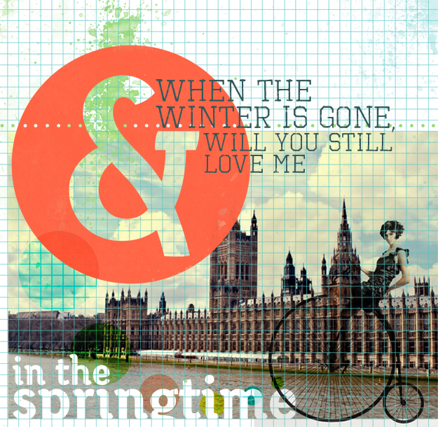
DESIGN #66: IN THE SPRINGTIME
When the winter is gone will you still love me in the springtime? I always love it when random phrases pop into my head. I checked around and don't think this expression is coming from anything. It's an oddly sad but hopeful tangle of words from out of nowhere contrasted with a whimsical design. Photo credit for the unicycle photo goes to Michael Creagh, and photo of the London Parliment is mine.
