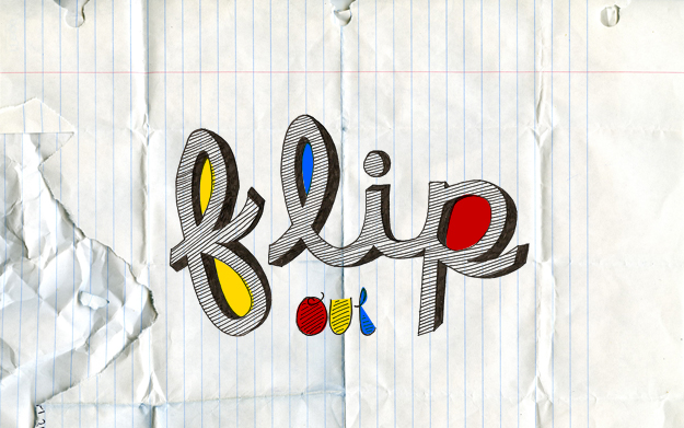
Have I mentioned how much I love drawing type? Right. The thing I love most about hand drawn typography is there isn't the pressure of making it perfect. The slightly shaky lines, the lines that accidentally wander outside of the boundaries of the typography...that's what I love. It's tactile and human and you don't get that naturally with digital art.
Frank Chimero had a blog post recently called Faking It. Here it is in a nutshell:
“How do you get those uneven edges in your illustrations?” “I draw them, unevenly.”
“What’s the best way to get this to look like it’s cut out of paper?” “Cut it out of paper.”
“What typeface are you using? It looks so much like handwriting.” “That’s my handwriting.”
Of course. That's what I love.
..............................
1920 x 1200 | 1280 x 1024 | 1280 x 800 640 x 960 | 320 x 480
..............................
