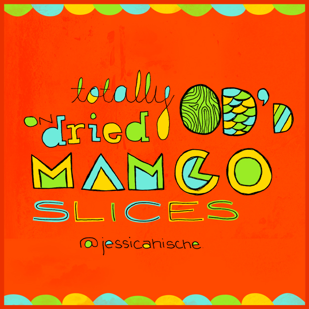
Today's design for my new Twitter series comes from the fabulously talented type nut, Jessica Hische. I wanted this design to feel tropical (because of the mango) while conveying spunk.
 The Commute Design Project is my personal challenge to create designs on my train commute from work to home. The Twitter series is part of my goal to document spamm-y, interesting, and funny tweets through hand drawn type
Commute Design Project 12: The Most Unhealthy Commute
Last week, an article from Forbes.com caught my eye about the most unhealthy commutes in the United States. It wasn't difficult to guess which area of the lower 48 would top the charts — it's a well known fact that LA is akin to a driving nightmare. The article says that not only do So-Cal commuters experience the worst pollution levels, they also have the highest rate of fatal auto accidents, and spend an average of 93 hours per year sitting in traffic.
Yikes.
Disclaimer: I have to admit that the typography on this gem was drawn at home.

Commute Design Project 08: Welcome to my neighborhood
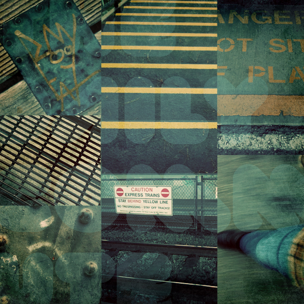
I work in a really interesting part of San Francisco. It's right on the bay and used to be a big shipping area, but that died off a while back. I was told that it's only been in the past few years that Dogpatch has started to come back to life which makes for an interesting mix of old/grundy/trendy/cool. The neighborhood could seem a little scrappy for a first-timer, but I love it. So rather than bring you some sort of foodie design this evening, I collected images of my walk from B'stro to the train station (i.e., a few benches under 280).

Design 03.2011: Spicy Hot Love
If you couldn't tell yesterday, I'm using drawings that I previously created in my Sketchbook Project journal, taking a picture of the sketch I want to use with my iPhone, emailing it to myself, and adding digital elements. It is quite the process and the picture isn't always pretty, but that's part of what I love about this project. Even the best designers don't turn out 5-star designs every time they sit down in front of the computer (or sketchbook).
Admittedly, I started this design on my commute to work this morning. I already knew what sketch I wanted to use and didn't want to wait. I love how the bag behind the journal is blown out — I think it adds to the concept. I also think you'd all probably agree, this should have been yesterday's design.
And yes, I've got an addiction to bright colors. I'm sure it's just a phase.
