I heart ffffound.
...clients.
I have to admit, this one rivals "Make My Logo Bigger Cream" http://view.break.com/542649 - Watch more free videos
iso50.
 One of my absolute favorite places to go when I'm searching for vintage inspiration is ISO50. This guy (Scott Hansen) has some amazing work. From typography to music, from tshirts to an exclusive Obama poster, he's got it all. I just can't get enough of his style.
In his words, he originally started his site to showcase his design work, but over the years, it's turned into a shop, clothing line and blog. He once worked for Adobe, but gave it up to work as a freelancer, and from there to designing for himself full time.
Of his work he says, "Design, to me, is the search for efficiency. Efficiency in conveying a message, efficiency of form."
"It is these constraints that force us as designers to reveal the core of the idea we are trying to express and to seek the most direct route to it. In this way, all of the periphery and excess of illustration and fine art can be shed to expose the roots of visual communication and express them in a concise and instantly understandable form."
Yet at the same time, he warns fans that he doesn't take himself or his work seriously.
And that folks, is what makes the work even better.
...huh?
 So, Walmart has a new logo. I stumbed across this piece of news today when I received my July edition of the Graphic Design USA newsletter. According to the press release:
"Walmart has revamped its logo as part of an “ongoing evolution” of the company. A terse official announcement states: “This update to the logo is simply a reflection of the refresh taking place inside our stores and our renewed sense of purpose to help people save money so they can live better.”
Ha. I disagree with all of the above.
It's no secret that I'm not a fan of Walmart. My husband and I stopped shopping there a little over a year ago and have yet to regret it. I searched Google to find out more about this "updated" logo, and here are a few of the things I found on Brand New.
The design community is not shy. Release a brand new logo and you'll find out what they think faster than you can ...er.... snap.
"IT'S SO HUGE!!!
What is up with that giant asterisk?
But really, this is not Wal-Mart. This is K-mart, Apple, and Sprint churned through a meat grinder. This would be nice for a competitor of Foto-Mat (I guess they're not around anymore). The breezy blue and sunny spurt would look nice on little huts sitting in the middle of a parking lot... at Wal-Mart!
This makes me aware of how appropriate the former "big box" logo was: "We're Wal-Mart, we're big, and we're gonna sell you everything." And with the 'MADE-IN-USA' star-as-hyphen.... "Oh yeah, and *BAM*, we're patriotic, too."
So the new one is kinder, gentler, but very inappropriate."
"It's like a ring of golden cannons, all aimed at small-town America. The blue, of course, represents the depression Wal-Mart employees cannot afford to medicate."
"Loading... Loading... Loading..."
"At least they are sort of practicing what they preach.
save money = logo for $59.95 live better= Director of Marketing uses extra $100K left over from branding update to go to Aruba."
"Don't block the big box.
This Walmart "thang"... oh dear, wishing it was April 1st…clicking my heels together...there's no place like home, there's no place like home...it's still there...the best part is the way it was "unveiled" like a cheap floozy in a "made in china" polyester track suit wrapped up in a cheesy, bad, rendering...very fitting actually. Actually launching this thang properly would have called even more attention to the complete and utter unoriginality of it all."
And my personal favorite:
Now when I look at the new Walmart logo, the only thing I see is Mmmmm. Candy Corn.
come to the show.
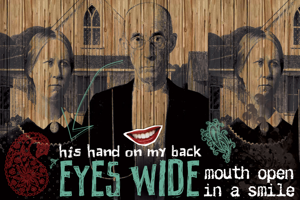
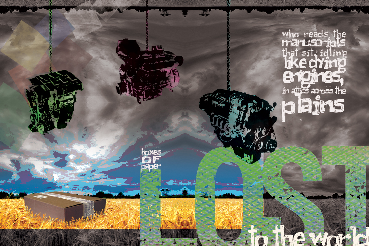
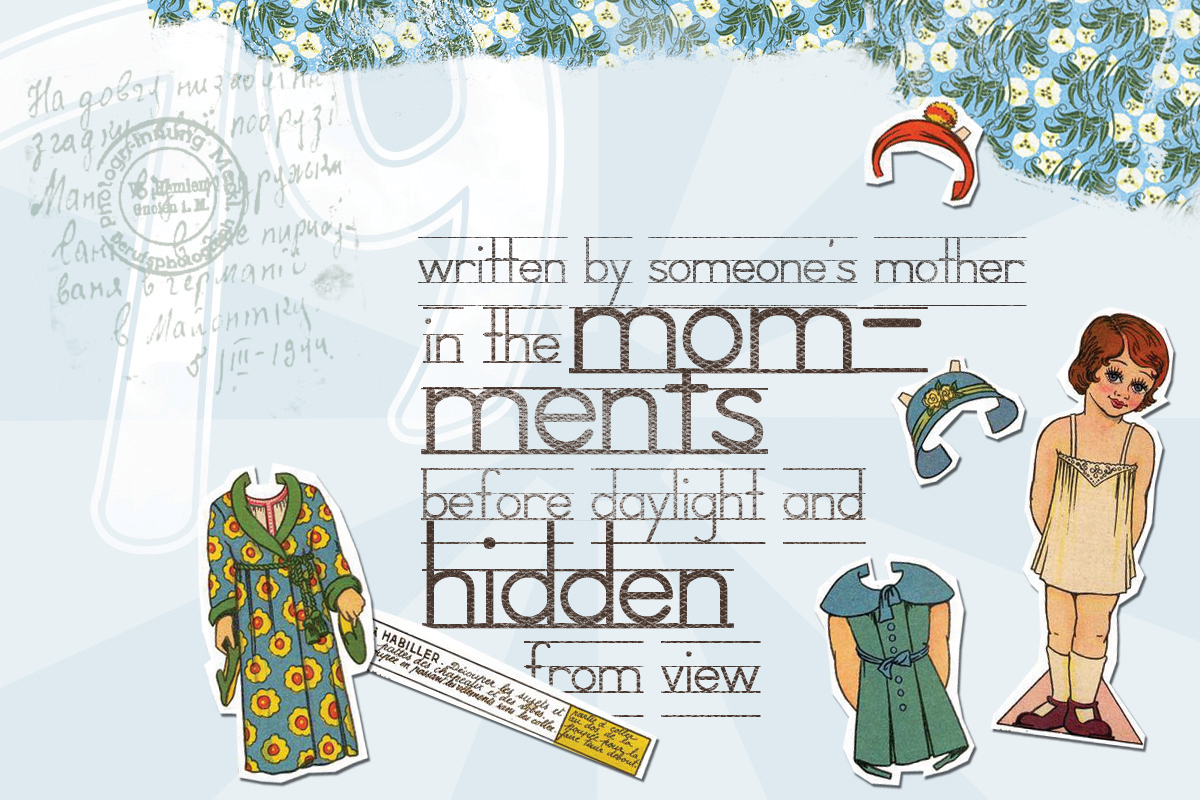
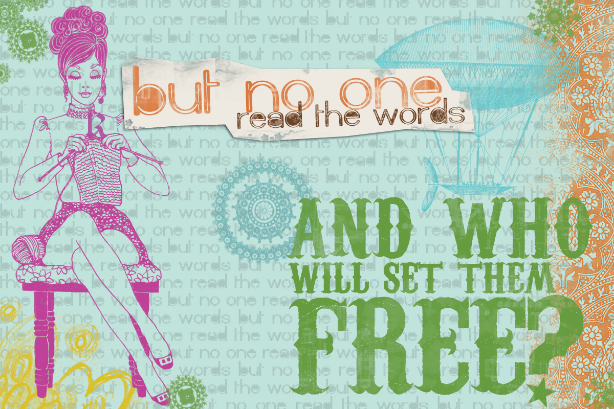
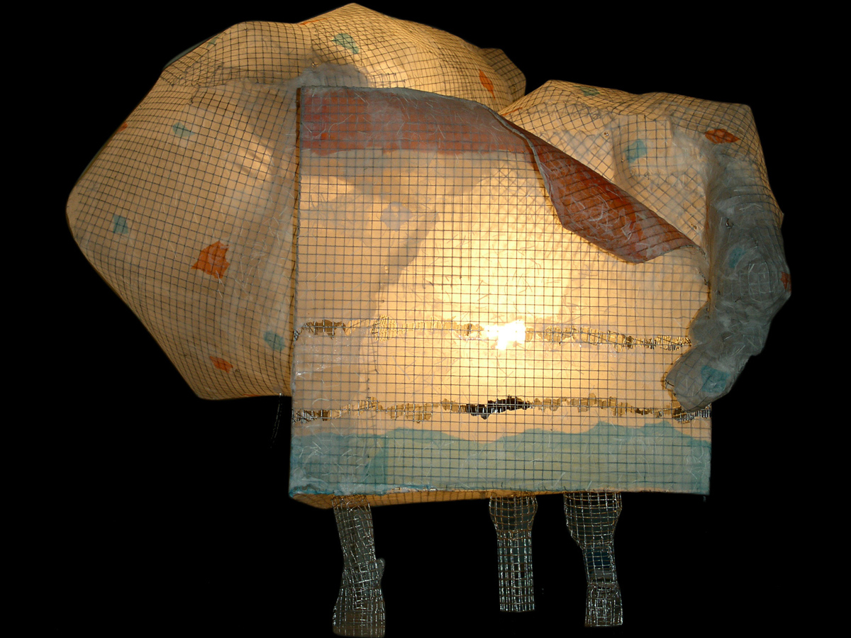
This just in. Two of my fine art pieces have been selected to be on display at a gallery showing in Indianapolis August 1, 2008. The show is hosted by a couple of the members of the Creative Commerce:Art and Design group on Smaller Indiana.
Hosted by Wug Laku's Studio & Garage and in conjunction with Indianapolis Artists and Dealers Association First Friday Gallery Tour on August 1, 2008, 'Elegant Funk' provides a unique opportunity to showcase individual members work in a professional urban/industrial gallery space. Smaller Indiana food, wine, music and businesses will also be on hand to further enhance an already eventful evening.
Anyone and everyone is invited to attend! Feel free to contact me for more information.
