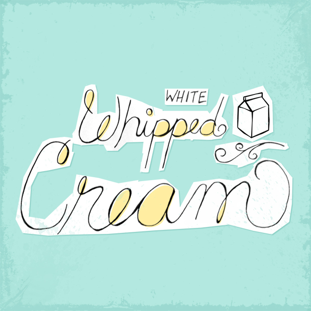
I'm one of those extraordinarily lucky people in the U.S. that got President's Day off work, which also means there is no commute for me today. However, this morning I was feeling productive and whipped (pun intended) up a design for you to enjoy. Doesn't white whipped cream have a nice ring? Here's to the Presidents!
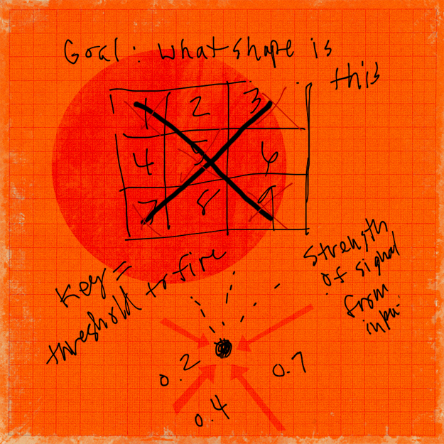
Commute Design Project 05: Threshold to Fire
Many of you may already know my husband is a software developer, and a good one at that. But you may not know that he's also quite an innovator and thinker. Not only does he spend his days at Apple writing code that looks like Greek to most of the world, he's constantly thinking of new ideas. The other night I caught him sketching on his iPad and begged him to send me a screenshot. The elements all tie together very nicely, plus I love merging science, math, and design — the results are always gorgeous.
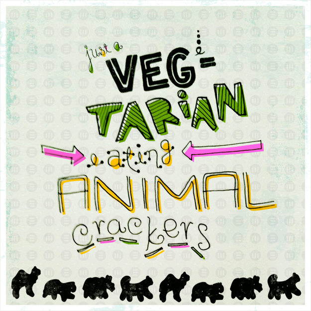
Design 04.2011: A Vegetarian Eating Animal Crackers
Do vegetarians eat animal crackers? I'm sad to say this isn't my own original quote — just a quick Google search will tell you that. And yes, you'll even find actual questions about whether or not vegetarians are allowed to eat animal crackers. I'm a flexitarian-leaning-toward-vegetarian but I can tell you one thing. I eat animal crackers.
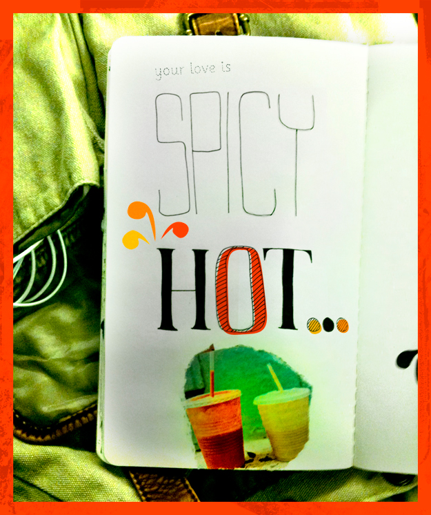
Design 03.2011: Spicy Hot Love
If you couldn't tell yesterday, I'm using drawings that I previously created in my Sketchbook Project journal, taking a picture of the sketch I want to use with my iPhone, emailing it to myself, and adding digital elements. It is quite the process and the picture isn't always pretty, but that's part of what I love about this project. Even the best designers don't turn out 5-star designs every time they sit down in front of the computer (or sketchbook).
Admittedly, I started this design on my commute to work this morning. I already knew what sketch I wanted to use and didn't want to wait. I love how the bag behind the journal is blown out — I think it adds to the concept. I also think you'd all probably agree, this should have been yesterday's design.
And yes, I've got an addiction to bright colors. I'm sure it's just a phase.
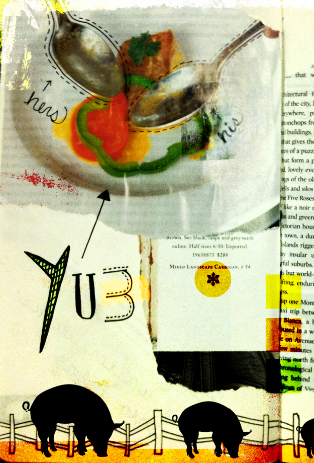
Design 02.2011: Eat Pork
It's Valentines Day and lots of starry-eyed couples will be heading out for dinner. A perfect day for a food-related design! I had an entire story about being from the midwest, signs promoting beef and pork...but I have to admit, this one is just a good excuse to use pigs in a design.
Things You Find on Restaurant Napkins
Last year I challenged myself to a personal design project. My goal was to create at least 5 non work-related designs each week, and each month I gave myself a mini challenge. It was a lot of fun, stretched me as a designer, and kept me away from silly time-wasting TV shows I didn't need to watch. So, I'm going to do it again.
My first challenge is to finish the Sketchbook Project that I didn't complete. It's never to late to start...er finish...right? The theme of my sketchbook was "Things You find on Restaurant Napkins", so I'm going to continue with restaurant / food-related designs for the next few weeks.
I'm also throwing in another challenge for myself. My train commute is about 75 minutes long and my goal is to have something ready to post in that 75 minutes. Whew! Enough challenges?
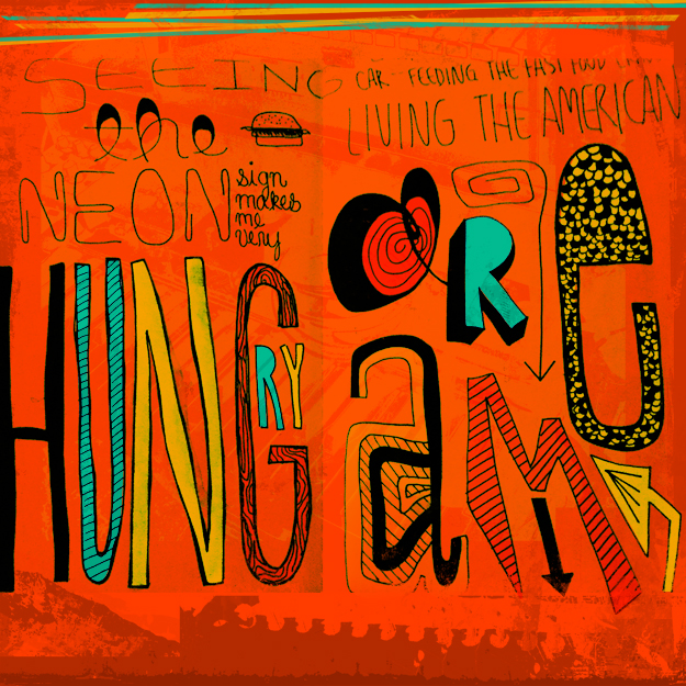
Here's No. 1: Feeding the Fast Food Crave
Seeing the neon sign makes me very hungry. Sitting in my car, feeding the fast food crave. Living the American Dream.
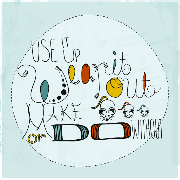
Design #110:Use it up
I've been reading a book called Outliers by Malcolm Gladwell (highly recommended by the way). He's studied trends in professional athletes, extraordinary musicians, and all-around successful people and the one thing that sticks out is (contrary to popular belief) they aren't just lucky people. These people have taken advantage of prime circumstances and practiced - most of them over 10,000 by their mid-twenties. Mind blowing, intimidating, and inspiring all at the same time! So, rather than completely abandon my extra-cirricular design a day project, I've decided to try and post at least one a week.
The following quote was submitted by my brother and sister-in-law. They found it in a magazine and thought it would make a cool design. After a bit of research, I found the quote is typically attributed to someone named L. Reid.
...........................
Use it up. Wear it out. Make do, or do without. - L.Reid
...........................