On a day that I'm feeling especially down in the dumps about my design abilities, I find this image posted on The Dieline and the world seems a bit brighter. Last semester in my Package Design we were challenged to produce an entirely new product from an existing brand. My group chose to create the packaging for Optic Adrenaline, energy eyedrops by Rockstar. We ended up using one of the logos I designed, and it looked strikingly similar to the G on these Goundry-G wine bottles, except the G was an O.
And I can't help but note, is it just me, or does that G look slightly "rockstar'ish" for a bottle of wine?
Compliments of Turner and Duckworth and The DieLine


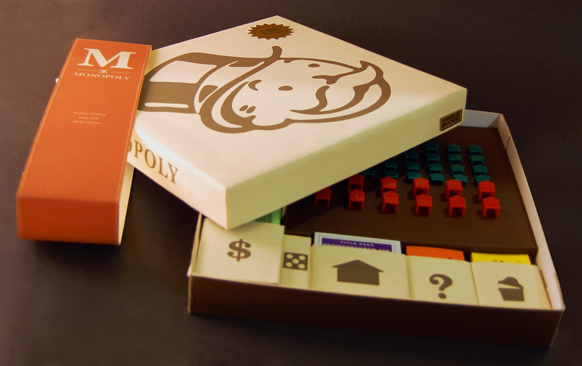
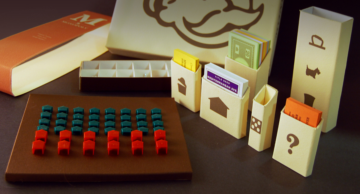
 No explanation needed. These are gorgeous.
 Markku Pyymaki


 Brainchild of