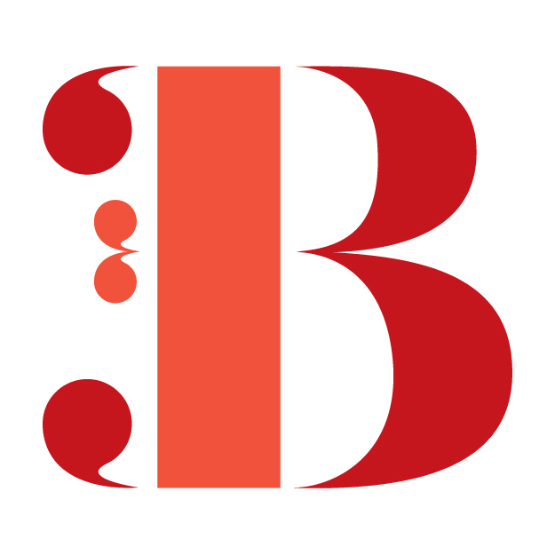
DESIGN #22: B
DESIGN #21: A
As I mentioned in the January Roundup, February's challenge is to design a letter a day. This challenge is specifically inspired by the amazing Jessica Hische and her Daily Drop Cap series. While inspired by Daily Drop Cap, my letters won't necessarily all fall into the drop cap category. For practical purposes, I'm starting with A, and although February is a short month, I plan to complete a full alphabet by the end of the month.
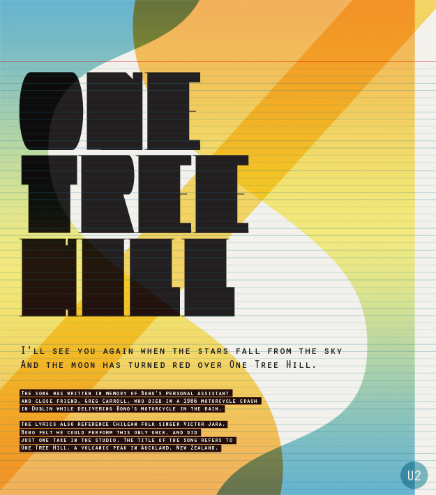
DESIGN #20: ONE TREE HILL
Despite some teasing, I have always really liked U2. I've had Bullet the Blue Sky in my head most of the day, but the One Tree Hill letters just looked better in this composition. Plus, it's got an extremely emotional story behind it and the sound reflects that. More history behind the lyrics in the design below...
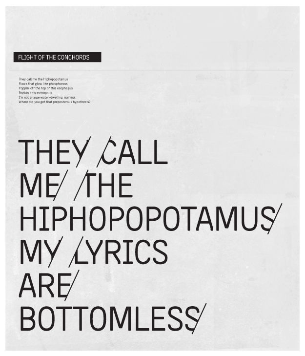
DESIGN #19: FLIGHT OF THE CONCHORDS
My husband and I fell in love with Bret and Jemaine from Flight of the Conchords a couple of years ago. They are just generally funny guys. Design #19 was inspired when the lyrics to Hiphopopotamus Vs. Rhymenoceros jumped into my head at 5:30am this morning. (I went to bed at 9:30pm last night, so yes, that is an acceptable time to be awake.) The poster was mainly created in Illustrator and I pulled it into Photoshop to add texture. The font is Neighborhood.
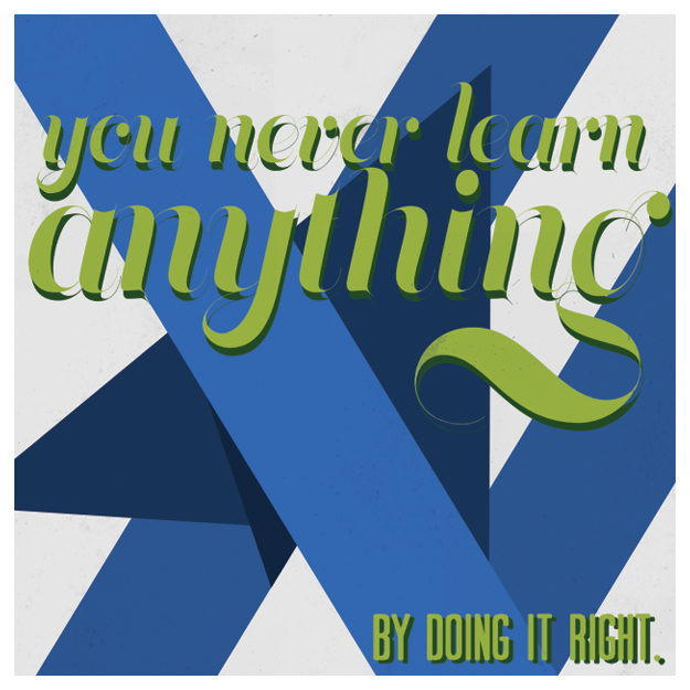
DESIGN #17: YOU NEVER LEARN ANYTHING
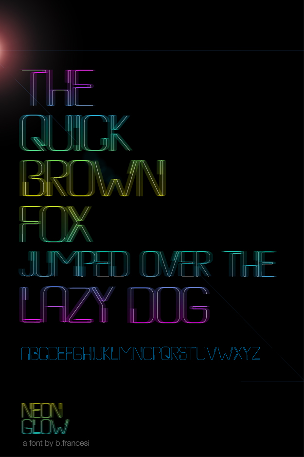
NEON GLOW
After a few photoshop modifications, I've finally created a poster for one of the versions of the font I created this summer. If you compare, you can tell that I've applied motion blur and a gradient overlay to the font stroke. While it's interesting at the very least, it still looks slightly commercial. Not sure that I'm stuck on this yet...
