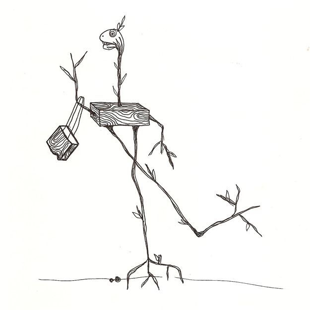
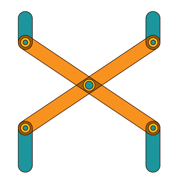
DESIGN #48: THE SHOPPING STICK
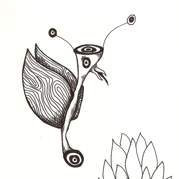
I've got a brand new sketchpad and a set of Micron pens so I think it's official. I'm hoping to stay on a sketching kick even after March is over and fill the sketchpad by the end of the year. And, since my mind is filled with much more exciting things than living room chairs, I've decided that I'm going to draw things from there instead.
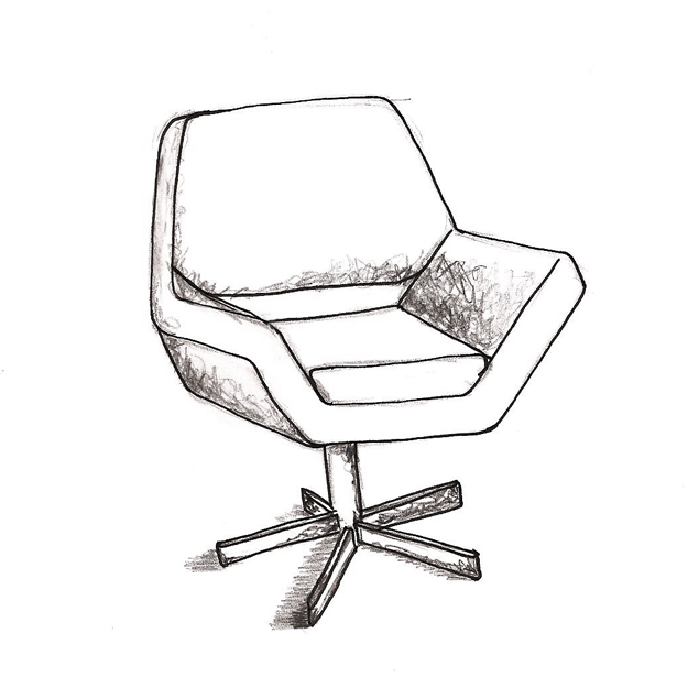
DESIGN #47: LIVING ROOM CHAIR
The month of March (or at least parts of it) will be dedicated to sketches. And before we get too far into this, let me set something straight; I'm no illustrator and not even that great with drawings. Alas, I'll make no apologies. There is a funky, semi-distorted style to most everything I draw and while in Kansas, I had an excellent Drawing II teacher who taught me how to turn my weird style into a strength. I'm looking to get that back.
Sketching is probably the most difficult (and makes me feel the most vulnerable) of all the challenges I'm assigning myself this year. The purpose of this month's challenge is to get me back to the basics. It's an important aspect of design that most designers tend to neglect including me. Hopefully there will be a dramatic improvement by March 31.
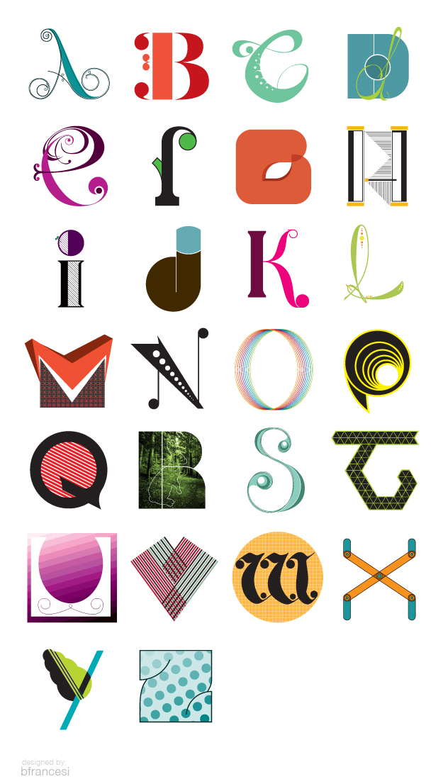
Unfortunately, March will be a short month because it took a week longer to finish the alphabet than intended, and during the last week of March I'll be in the UK *hooray!* so I'll probably be posting a photo a day in lieu of a sketch.
With that long-winded explanation, today's sketch is one of our living room chairs.
FEBRUARY ROUNDUP
DESIGN #45: Y
Most of my letters start with some idea of the direction I plan to go, and it usually ends up somewhere along the lines of my original idea. Today was an exception. Last night I knew exactly what I wanted Y to look like. Really curvy and beautiful. I even sketched it out which I tend not to do with my design a day letters because my goal is to spend no more than an hour on any design a day project. When I started converting the beautiful hand drawn curves into bezier deliciousness, I just couldn't make myself finish. It seemed too cliche.
What you see below is an experiment. Beautiful or not, experimentation is productive, and in this case, is the result of throwing a bunch of shapes into one space and forcing myself to organize them in a way that works.
DESIGN #44: X
DESIGN #43: W
This weekend I realized my goal of finishing the entire alphabet by the end of February was a little precipitous. Between Friday evening and Sunday I would have needed to design 4 letters and while that certainly would have been possible, I don't want to start focusing on quantity over quality. W was inspired by a gorgeous Blackletter font found on the I Love Typography blog this weekend. Absolutely drop-dead gorgeous. The digital version is available for purchase on MyFonts.com as Fette-Fraktur and will probably be my next font purchase.
